Creating a DataTable Component
Create a component using schematics and name it with your initial E.g:
jd-datatable
We are going to make it render the Material UI's table at https://material-ui.com/components/tables#data-table, which displays a set of data, similar to the existing sc-datatables.
To do this:
-
Install the @material-ui/core module with:
yarn add @material-ui/core -
Import the Data Grid libraries in src/components/JdDatatable.tsx with:
import Table from '@material-ui/core/Table'; import TableBody from '@material-ui/core/TableBody'; import TableCell from '@material-ui/core/TableCell'; import TableContainer from '@material-ui/core/TableContainer'; import TableHead from '@material-ui/core/TableHead'; import TableRow from '@material-ui/core/TableRow'; import Paper from '@material-ui/core/Paper'; -
Import the WithGrid wrapper:
import WithGrid from '../utils/WithGrid'; -
Let's use this example and this to your datatable's component definition:
json
{
            "componentName": "jd-datatable",
            "label": "Component List",
            "name": "grid",
            "filter": "{'query':{'bool':{'must':[{'match':{'systemHeader.systemType':{'query':'component'}}}, {'match':{'appTags':'system'}}, {'match':{'appTags':'componentDefinition'}}]}}, 'sort':[{'systemHeader.summaryName':'asc'}]}",
            "gridColumns": [
                {
                    "displayName": "Name",
                    "field": "name"
                },
                {
                    "displayName": "Version Number",
                    "field": "versionNumber"
                },
                {
                    "displayName": "Version Comment",
                    "field": "versionInfo",
                    "type": "string"
                }
            ],
            "fullWidth": true
        }
This filter query will fetch data with "systemHeader.systemType" of "component". -
Replace the component properties with:
javascript
    const JdDatatable = ({
        fieldValue,
        componentDefinition,
        columns,
        loading,
        rows
    })
6. The WithGrid wrapper will give us columns, loading, rows variables. We now wrap the whole component, change the bottom part with:```javascript const wrapped = WithGrid(JdDatatable); convertToCustomElement('jd-datatable', wrapped);
export default wrapped;
7. We can now use the rows and columns variables, replace the JSX:html``` To:jd-datatable works. Please edit src/components/JdDatatable.tsx to make changes
Next Steps
-
.
.
.
.
html
   <TableContainer component={Paper}>
      <Table aria-label="simple table">
        <TableHead>
          <TableRow>
            {
              columns && columns.map(c => <TableCell>{c.displayName}</TableCell>)
            }
          </TableRow>
        </TableHead>
        <TableBody>
          {rows.map((row) => (
            <TableRow key={row.name}>
              {
                columns && columns.map(c =>
                <TableCell component="th" scope="row">
                  {row[c.field]}
                </TableCell>)
              }
            </TableRow>
          ))}
        </TableBody>
      </Table>
    </TableContainer>
You should see the component build in the npm watch window:

webpack 5.14.0 compiled <span style="color:green">successfully</span> in 208 ms
-
Reload the component test template. A datatable will display:
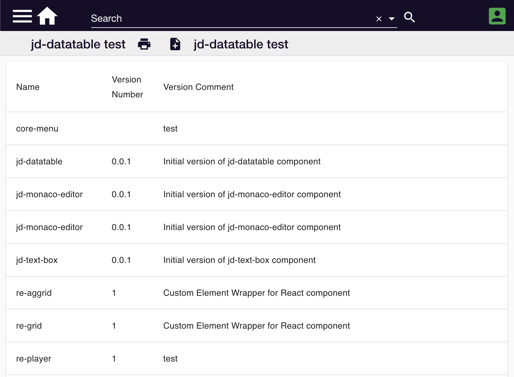
This example is available at https://github.com/formbird-components/component-examples/tree/master/jd-datatable
You can now enhance this like adding search, pagination, and sort. There are examples you can follow at https://material-ui.com/components/tables/#data-table. You can also experiment data grids other than material-ui: * https://www.ag-grid.com/documentation/javascript/ * https://ant.design/components/table/ * https://www.primefaces.org/primereact/showcase/#/datatable/basic * https://adazzle.github.io/react-data-grid/