sc-menu

1 Purpose
This document is a user guide for the sc-menu component as of version 7.6.2
Sc-menu standardises a menu drop down component for formbird. The component allows ....
The sc-menu definition provides fields for setting the properties of the menu dropdown and is fully described below.
2 Definition
Sc-menu is defined by a set of name/value pair fields consisting of:
- Required system fields
- Required customizable fields
- Optional customizable fields
Note:
- Default values for fields described in the tables below are shown in bold text.
2.1 Required System Fields
| Field | Valid Values | Description |
|---|---|---|
| componentName | sc-menu | The component name. Example: "componentName": "sc-menu" |
2.2 Required Customizable Fields
| Field | Valid Values | Description |
|---|---|---|
| name | Any value written in camel case. | Defines the name of the field in the document and database. Example: "name": "testScMenu" |
2.3 Optional Customizable Fields
| Field | Valid Values | Description |
|---|---|---|
| colour | html color string | The colour of the menu button. Can be any html color string Defaults to purple (#160d2a). Example: "colour": "green"`"colour": "#ff6347" |
| dropColour | html color string | Background colour of the drop down. Can be any html color string Defaults to white. Example: "dropColour": "green""dropColour": "#ff6347" |
| dropTextColour | html color string | The colour of the drop down text. Can be any html color string Defaults to black. Example: "dropColour": "green""dropColour": "#ff6347" |
| dropWidth | string | Defines the width of the drop down. Can be one of two settings: "align" or "full". Align opens the dropdown at the same width as the drop down. Full opens the drop down to the max width of the text in the drop down. Defaults to align. Example: "dropWidth": "full" |
| enabled | false | The note box field is greyed out. A Stop icon appears on mouseover. A value cannot be entered in the field. Example: "enabled": false |
| true | Default value. A value can be entered in the field. | |
| fullWidth | true | The field displays full width on the form. Example: "fullWidth": true |
| false | Default value. The field does not display full width on the form. | |
| height | integer | The height of the component in pixels. Example: "height": 100 |
| 75 | Default value. | |
| items | Array | Menu items array that provides both the url and the display name. Must be an array of items with the following format... Example: "items": [{"label": "Example Label 1", "url": "/form/f1fe21c8-ce35-40f1-ab91-93b7919fbed3"}] |
| label | Any value | Defines the text on the dropdown on the form i.e. the field label. Example: "label": "Test sc-menu dropdown" |
| Defaults to the field displays without a field label on the form. | ||
| mandatory | true | The note box field displays as mandatory (i.e. label in red text with an asterisk). Saving without a value, a message prompts the user to enter a value for the note box field. Example: "mandatory": true |
| false | Default value. The note box field displays as optional (i.e. label in black text). | |
| openType | String | How the component opens the dropdown. Can be one of two options: "click" or "hover". Defaults to "click". Example: "openType": "click" |
| textColour | string | Text colour for the dropdown menu. Can be any html color string Defaults to white. Example: "textColour": "green""textColour": "#ff6347" |
| textSize | Integer | Text size for the dropdown menu. Can be any integer greater than 0. Defaults to 16. Example: "textSize": 30 |
| urlTarget | string | String that defines where the url is opened. Must be one of "newWindow" or "current". Defaults to "newWindow" Example: "urlTarget": "newWindow" |
| visible | false | The menu drop down is not visible on the form. Example: "visible": false |
| true | Default value. The menu drop down is visible on the form. | |
| widthType | string | Determines how the drop down wraps around the text. Can be one of two types, "block" or "contained". Defaults to block. Example: "widthType": "block" |
3 Typical Definition
Below is a typical sc-menu definition, defined with its required fields plus any optional field whose value is typically other than its default value.
{
"componentName": "sc-menu",
"items": [
{
"label": "First option",
"url": "/form/f1fe21c8-ce35-40f1-ab91-93b7919fbed3"
}
],
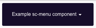
"label": "Example sc-menu component",
"name": "exampleMenu"
}
One or more of the optional fields shown below can be included in the above definition should a value other than their default value be required.
    "mandatory": true,
    "enabled":false,
    "visible":false,
        "items": [{
                    "label": "First option because you am cool",
                    "url": "/form/f1fe21c8-ce35-40f1-ab91-93b7919fbed3"
              }],
    "textColour": "red",
    "widthType": "block",
    "colour": "pink",
    "dropColour": "grey",
    "dropTextColour": "white",
    "openType": "hover",
    "urlTarget": "newWindow",
    "textSize": 20,
    "dropWidth": "full",
    "height": 100
4 Examples
Example 1
Below is a typical sc-menu definition, defined with its required fields plus any optional field whose value is typically other than its default value.
{
    "componentName": "sc-menu",
    "enabled": true,
    "label": "Drop colours Menu",
    "name": "dropMenu",
    "items": [
        {
            "label": "First option because you am cool",
            "url": "/form/f1fe21c8-ce35-40f1-ab91-93b7919fbed3"
        }
    ],
    "textColour": "pink",
    "dropTextColour": "pink",
    "dropColour": "black",
    "colour": "black"
},