sc-note-box

1 Purpose
This document is a user guide for the sc-note-box component as of version 5.11.
sc-note-box places a note box field on a form, allowing the user to enter of lines of text. The default height of a note box field is 3 lines. The note box field automatically scrolls if more than 3 lines of text are entered. A drag handle on the bottom right corner allows the user to manually increase the height of the note box.
The sc-note-box definition provides fields for setting the properties of a note box field and is fully described below.
2 Definition
sc-note-box is defined by a set of name/value pair fields consisting of:
- Required system fields
- Required customizable fields
- Optional customizable fields
Note:
- Default values for fields described in the tables below are shown in bold text.
2.1 Required System Fields
| Field | Valid Values | Description |
|---|---|---|
| componentName | sc-note-box | The component name. Example: "componentName": "sc-note-box" |
2.2 Required Customizable Fields
| Field | Valid Values | Description |
|---|---|---|
| name | Any value written in camel case. | Defines the name of the field in the document and database. Example: "name": "testScNoteBox" |
2.3 Optional Customizable Fields
| Field | Valid Values | Description |
|---|---|---|
| defaultValue | Any value | The value to initially load in the note box field. Example: "defaultValue": "This is the default Note" |
| Defaults to no value is initially loaded. | ||
| disableSave | true | Changing the sc-note-box field value (i.e. entering or editing lines of text in the note box) does not trigger the Save icon to flash. Exiting the form without saving changes to the sc-note-box field value does not trigger a warning message to display. In the Angular version of the sc-note-box component, clicking the Save icon will not save the sc-note-box field value to the document. In the AngularJS version of the sc-note-box component, clicking the Save icon will save the sc-note-box field value to the document. Example: "disableSave": true |
| false | Default value. Changing the sc-note-box field value (i.e. entering or editing lines of text in the note box) does trigger the Save icon to flash. Exiting the form without saving changes to the sc-note-box field value does trigger a warning message to display. In both the Angular and AngularJS versions of the sc-note-box component, clicking the Save icon will save the sc-note-box field value to the document. |
|
| displayCharacterCount | Works in conjunction with "limitCharacterCount" and "visualCharacterCount". |
|
| true | Displays a character count in the top right corner of the note box. If "limitCharacterCount": 100 then on entering 37 characters, the character count would display as 37/100.If the number of characters is unlimited (i.e. "limitCharacterCount": 0) then on entering 37 characters, the character count would display as 37.Example: "displayCharacterCount": true |
|
| false | Default value. A character count is not displayed. | |
| enabled | false | The note box field is greyed out. A Stop icon appears on mouseover. A value cannot be entered in the note box field. Example: "enabled": false |
| true | Default value. A value can be entered in the note box field. | |
| fullWidth | true | The note box field displays full width on the form. Example: "fullWidth": true |
| false | Default value. The note box field does not display full width on the form. | |
| label | Any value | Defines the name of the note box field on the form i.e. the field label. Example: "label": "Test sc-note-box" |
| Defaults to the note box field displays without a field label on the form. | ||
| limitCharacterCount | Works in conjunction with "displayCharacterCount" and "visualCharacterCount". |
|
| Integer | The maximum number of characters that can be entered into the note box field. A value of 0 indicates there is no limit to the number of characters that can be entered. When the maximum number of characters have been reached, no further characters can be entered. Example: "limitCharacterCount: 100" |
|
| 0 | Default value. There is no limit to the number of characters that can be entered. | |
| mandatory | true | The note box field displays as mandatory (i.e. label in red text with an asterisk). Saving without a value, a message prompts the user to enter a value for the note box field. Example: "mandatory": true |
| false | Default value. The note box field displays as optional (i.e. label in black text). | |
| noteBoxRows | Integer | Specifies the number of rows to display in the note box field. Example: "noteBoxRows": 10 |
| 3 | Default value. The note box field displays 3 rows. | |
| visible | false | The note box field is not visible on the form. Example: "visible": false |
| true | Default value. The note box field is visible on the form. | |
| visualCharacterCount | Works in conjunction with "displayCharacterCount" and "limitCharacterCount". |
|
| true | Display a line whose length indicates what percentage of the allowed maximum number of characters has been entered. The start point of the line is under the note box label and extends horizontally to right edge of the notebox on reaching 100%. Example: "visualCharacterCount": true |
|
| false | Default value. Do not Display a line whose length indicates what percentage of the allowed maximum number of characters has been entered. |
3 Typical Definition
Below is a typical sc-note-box definition, defined with its required fields plus any optional field whose value is typically other than its default value.
{
    "componentName": "sc-note-box",
    "label": "Test sc-note-box",
    "name": "testScNoteBox",
    "fullWidth":true
}
One or more of the optional fields shown below can be included in the above definition should a value other than their default value be required.
    "mandatory": true,
    "defaultValue": "This is the default Note",
    "displayCharacterCount": true,
    "disableSave":true,
    "enabled":false,
    "limitCharacterCount": 100,
    "noteBoxRows": 10,
    "visible":false,
    "visualCharacterCount": true,
4 Examples
Example 1
Below is a typical sc-note-box definition, defined with its required fields plus any optional field whose value is typically other than its default value.
        {
            "componentName": "sc-note-box",
            "name": "testScNoteBox",
            "label": "Test sc-note-box",
            "fullWidth": true
        }
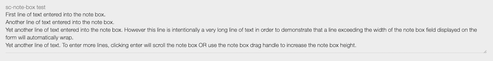
Resulting field on the form:

Resulting field on the form after entered a value in the note box field:
This sc-note-box field was defined without a noteBoxRows value and hence its display height will default to 3 rows. In the images immediately above and below, the note box drag handle was used to manually resize the note box in order to reveal all entered rows.
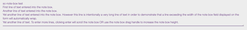
Resulting field on the form after saving the entered value:
Resulting field in the document and database after saving the entered value:
Horizontally scroll the image below to view the entire saved value, noting that on save, each new line is automatically prefixed with \n.
"testScNoteBox": "First line of text entered into the note box.\nAnother line of text entered into the note box.\nYet another line of text entered into the note box. However this line is intentionally a very long line of text in order to demonstrate that a line exceeding the width of the note box field displayed on the form will automatically wrap.\nYet another line of text. To enter more lines, clicking enter will scroll the note box OR use the note box drag handle to increase the note box height."