Adding a component project to the sc-components project
In the previous section, we’re able to set up a project with a component that we can directly import into the core. In this section, we will discuss how to add the component into the master components project, sc-components.
ScChipsModule
projects/sc-chips/src/app/sc-chips/sc-chips.module.ts
It is important to contain your component inside a module so that you won’t need to import all its required modules every time you use the component. Importing the module will be sufficient to prepare it for use.
Under its constructor, we have converted the ScChipsComponent into a custom element that we can access via names:
'sc-chips'
and
'sc-chips-web-component'
This conversion also registers the custom element into the browser’s CustomElementRegistry (window.customElements). Therefore, once the module is loaded, no further action is required to make the custom element available in the browser.
You only need to import the ScChipsModule into the sc-component project’s AppModule at
projects/sc-components/src/app/app.module.ts
@NgModule({
 declarations: [],
 schemas: [CUSTOM_ELEMENTS_SCHEMA],
 imports: [
    ...
    ScChipsModule, // this adds your component to the sc-component project
    ...
 ]
Completing the sc-chips Component
In the previous sections, we were able to generate the sc-chips component and display it into the formbird core application. In this section, we will complete the component into its final appearance and function i.e. a working component that extends material-angular’s mat-chip component. See https://material.angular.io/components/chips/overview for an overview about this material component.
Before we continue, we need to make sure that the following material libraries are installed. These are required so that our component can work properly:
'@angular/material/icon'
'@angular/material/chips'
'@angular/material/form-field'
Refer to the section On Using Angular-Material Libraries for the complete details. Your extra-webpack.config.json should contain the following entries:
// Material libs externalised by this project
"@angular/material/chips": "ng.material.chips"
"@angular/material/form-field": "ng.material.formField"
"@angular/material/icon": "ng.material.icon"
If you’ve added the libraries into the config file yourself, your project’s scripts section at angular.json should have the entries:
"scripts": [
  ...
  "node_modules/@angular/material/bundles/material-form-field.umd.js",
  "node_modules/@angular/material/bundles/material-chips.umd.js",
  "node_modules/@angular/material/bundles/material-icon.umd.js"
]
With all these in mind, let’s complete our sc-chips component so it can take in an array of strings as a fieldValue and display them:
-
Importing all required library modules to ScChipsModule ``` ... import {MatIconModule} from '@angular/material/icon'; import {MatChipsModule} from '@angular/material/chips'; import {MatFormFieldModule} from '@angular/material/form-field'; import { BrowserAnimationsModule } from '@angular/platform-browser/animations';
@NgModule({ declarations: [ScChipsComponent], imports: [ CommonModule, MatIconModule, MatChipsModule, MatFormFieldModule, BrowserAnimationsModule ] }) export class ScChipsModule { }
``
Importing these modules allows us to utilize the material library’s custom elements and animations like
, , , andelements. If you forget to import these modules, your sc-chips.component.html file will throw an error on compile time or may not work properly in runtime like when you omit to importBrowserAnimationsModule`. -
Adding code to the component’s HTML template Paste the following code into your
sc-chips.component.htmlfile:<mat-form-field> <mat-chip-list #tagList aria-label="Tags"> <mat-chip *ngFor="let tag of fieldValue" (removed)="remove(tag)" removable> {{tag}} <mat-icon matChipRemove>cancel</mat-icon> </mat-chip> <input [placeholder]="label" [matChipInputFor]="tagList" (matChipInputTokenEnd)="add($event)" class="redify"> </mat-chip-list> </mat-form-field>Our field elements need to be enclosed under a<mat-form-field>element in order for angular-material to properly apply the styles and boilerplate code. The functionsremove()andadd()are to be supplied in step 4 at the controller filesc-chips.component.ts -
Adding component-specific styles You will notice a style class applied to the
<input>element above and we declare that style atsc-chips.component.scss:.redify { color: red !important; font-weight: bold !important; }Styles declared here are local to the component and, in some cases, to its sub-components as well. - View Encapsulation
There might be instances where your component’s styles depend on its parent’s styles in order to display properly. This is typical when you have layout problems. You may need to
bleed-inthe styles from the parent component down into your own components so they apply to them. To do this add the following component option:@Component({ selector: 'sc-sc-chips', templateUrl: './sc-chips.component.html', styleUrls: ['./sc-chips.component.scss'], encapsulation: ViewEncapsulation.None // let styles bleed-in }) export class ScChipsComponent implements OnInit { constructor() { } ngOnInit(): void {} }Formbird components generally derive styles from the parent components that handle layout and the main container so it’s a good idea to set this one now. -
Adding component logic and deploying a prototype Based on the template html, we need to add the following into our controller file:
-
customScChipsPrefix: string //not present in the htmlThe string value will prefix new tags. -
label: stringThe string value that will be our input placeholder. -
fieldValue: string[]An array containing all our tags.
-
remove(tag)The function that handles the removal of a tag from
fieldValue -
add($event: MatChipInputEvent)The function responsible for adding tags into
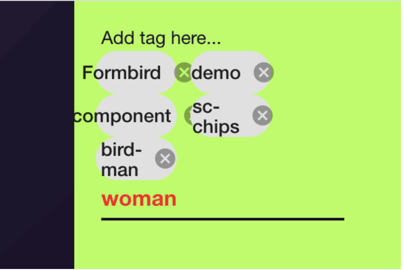
fieldValue``` export class ScChipsComponent implements OnInit { customScChipsPrefix = 'bird-'; label = 'Add tag here...'; fieldValue = ['Formbird', 'demo', 'component', 'sc-chips'];
constructor() { }
ngOnInit(): void {}

remove(tag: string) {
const index = this.fieldValue.indexOf(tag);
if (index >= 0) {
    this.fieldValue.splice(index, 1);
}
}
add($event: MatChipInputEvent) {
if (($event.value || '').trim()) {
    const n = `${this.customScChipsPrefix}${$event.value.trim()}`;
    this.fieldValue.push(n);
}
if ($event.input) {
    $event.input.value = '';
}
}
}
``` After adding the fields and functions as shown above, you can test this prototype by building the project and copying it to its final location at the core project. Make sure you delete the old version of the project to avoid conflicts.
``` // via CLI //1. Remove old sc-chips folder rm -rf
/fieldtec-web/server/public/vendor/custom-component-modules/sc-chips //2. build project ng build sc-chips --source-map
//3. Move project to destination mv dist/sc-chips
/fieldtec-web/server/public/vendor/custom-component-modules/sc-chips ``` You will observe our component is perfectly functional but it doesn’t interact yet with the core like when the core tries to pass data to it and vice versa.
The next step will discuss the boilerplate for allowing our component to interact with the core. 6. We need to add in a few boilerplate code to properly let our component properly interact with the core application.
First we’ll create an interface that extends the basic component definition whereby we add our component’s specific field
customScChipsPrefix.interface ScChipsComponentDefinition extends ComponentDefinition { scChipsPlaceholder?: string; }labelis already a standard component definition field whilefieldValueis a standardFormComponentfield. You don’t normally need to specifyfieldValuewhen you use/define the component in the template but you can add adefaultValueto it:"components": [ { "componentName": "sc-chips", "name": "myTags", "label": "Test sc-chips", "scChipsPlaceholder": "custom", "defaultValue": [ "Formbird", "demo", "component", "sc-chips" ] } ]7. Next, our component controller file must extend the base classAbstractComponent. The idea is all the common data, change detection, ngOnInit/ngOnDestroy are set up in the base class and if there is any specific behavior, we would override the methods from the base: -setFieldActivation: this method is to deactivate or activate the component from user interaction. -onFieldValueChanged: this method is the handler of changedDocument.watch(‘fieldName’) that handles field value changes from the store. -onControlValueChanged: this method is the handler of the changes when the user interacts with the form control. - Other methods are described atBest PracticesAll the fields specified in the
AbstractComponentare values that will be injected into the component by the core. Hence, we apply the@Input()decorator to them.We’ve removed our
labelandscChipsPlaceholderfields because they’ll be injected by the core into thecomponentDefinitionobject.``` export class ScChipsComponent extends AbstractComponent
{ constructor( protected changedDocumentService: ChangedDocumentService, protected componentSetupService: ComponentSetupService, protected cdr: ChangeDetectorRef ) { super(changedDocumentService, componentSetupService, cdr); } ``` 8. We’ll update our references to scChipsPlaceholder and label (at html view file) to fetch it from the componentDefinition object:
`` // add function this.fieldValue.push(${this.componentDefinition.scChipsPlaceholder}${$event.value.trim()}`);// sc-chips.component.html <input [placeholder]="componentDefinition.label" ``` 9. Build and run the project like at the end of step 5. Our component will now show values from the definition that we specified in our template:
-