sc-text-box


1 Purpose
sc-text-box places a sc-text-box field on a form, allowing the user to enter a single line of text.
The sc-text-box definition provides fields for setting the properties of a sc-text-box field and is fully described below.
2 Definition
sc-text-box is defined by a set of name/value pair fields consisting of:
- Required system fields
- Required customizable fields
- Optional customizable fields
Note:
- Default values for fields described in the tables below are shown in bold text.
2.1 Required System Fields
| Field | Valid Values | Description |
|---|---|---|
| componentName | sc-text-box | The component name. Example: "componentName": "sc-text-box" |
2.2 Required Customizable Fields
| Field | Valid Values | Description |
|---|---|---|
| name | Any value written in camel case. | Defines the name of the sc-text-box field in the document and database. Example: "name": "testScTextBox" |
2.3 Optional Customizable Fields
| Field | Valid Values | Description |
|---|---|---|
| defaultValue | Any value | The value to initially load in the sc-text-box field. Example: "defaultValue": "Formbird makes it possible" |
| Defaults to no value is initially loaded. | ||
| disableSave | true | Changing the sc-text-box field value (i.e. entering or editing text) does not trigger the Save icon to flash. Exiting the form without saving changes to the sc-text-box field value does not trigger a warning message to display. In the Angular version of the sc-text-box component, clicking the Save icon will not save the sc-text-box field value to the document. In the AngularJS version of the sc-text-box component, clicking the Save icon will save the sc-text-box field value to the document. Example: "disableSave": true |
| false | Default value. Changing the sc-text-box field value (i.e. entering or editing text) does trigger the Save icon to flash. Exiting the form without saving changes to the sc-text-box field value does trigger a warning message to display. In both the Angular or AngularJS versions of the sc-text-box component, clicking the Save icon will save the sc-text-box field value to the document. |
|
| enabled | false | The sc-text-box field is greyed out. A Stop icon appears on mouseover of the sc-text-box field. A value cannot be entered in the sc-text-box field. Example: "enabled": false |
| true | Default value. The sc-text-box field on the form is not greyed out. A Stop icon does not appear on mouseover of the sc-text-box field. A value can be entered in the sc-text-box field. |
|
| fullWidth | true | The sc-text-box field displays full width on the form. Example: "fullWidth": true |
| false | Default value. The sc-text-box field does not display full width on the form. |
|
| label | Any value | Defines the name of the sc-text-box field on the form i.e. the field label. Example: "label": "Test sc-text-box" |
| Defaults to the sc-text-box field displays without a field label on the form. | ||
| mandatory | true | The sc-text-box field displays as mandatory (i.e. label in red text with an asterisk). Saving without a value, a message prompts the user to enter a value for the sc-text-box field. Example: "mandatory": true |
| false | Default value. The sc-text-box field displays as optional (i.e. label in black text). Saving without a value, a message does not prompt the user to enter a value for the sc-text-box field. |
|
| visible | false | The sc-text-box field is not visible on the form. Example: "visible": false |
| true | Default value. The sc-text-box field is visible on the form. |
3 Typical Definition
Below is a typical sc-text-box definition, defined with its required fields plus any optional field whose value is typically other than its default value.
{
    "componentName": "sc-text-box",
    "label": "Test sc-text-box",
    "name": "testScTextBox"
}
One or more of the optional fields shown below can be included in the above definition should a value other than their default value be required.
    "defaultValue": "Formbird makes it possible",
    "disableSave":true,
    "enabled":false,
    "mandatory": true,
    "visible":false,
4 Examples
Example 1
A sc-text-box definition defined with the typically needed fields.
        {
            "componentName": "sc-text-box",
            "name": "scTextBoxTypicalDefinition",
            "label": "sc-text-box Typical Definition"
        }
Resulting sc-text-box field on the form:
The field label displays greyed out within the sc-text-box field.
Resulting sc-text-box field on the form after clicking the field and before entering a value:
On clicking the sc-text-box field:
- The field label displays above the field and also as greyed out within the field.
- A flashing cursor displays at the start of the field.

Resulting sc-text-box field on the form after entering a value:
On entering a value in the sc-text-box field:
- The entered value displays within the field.
- The field label displays as greyed out above the field.
- The "Save" icon flashes.

Resulting sc-text-box field on the form after saving the entered value:
On clicking the flashing "Save" icon:
- The "Save" icon stops flashing.
- A document is saved with the entered value.
Resulting field in the document and database after saving the entered value:
"scTextBoxTypicalDefinition": "Formbird makes it possible"
Example 2
A sc-text-box definition defined with the typically needed fields plus the optional mandatory field.
       {
            "componentName": "sc-text-box",
            "name": "scTextBoxNonTypicalDefinition",
            "label": "sc-text-box Non Typical Definition",
            "mandatory": true
        }
Resulting field on the form:
The field label displays as mandatory within the sc-text-box field.

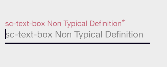
Resulting sc-text-box field on the form after clicking the field and before entering a value:
On clicking the sc-text-box field:
- The field label displays as mandatory above the field and also as greyed out within the field.
- A flashing cursor displays at the start of the field.
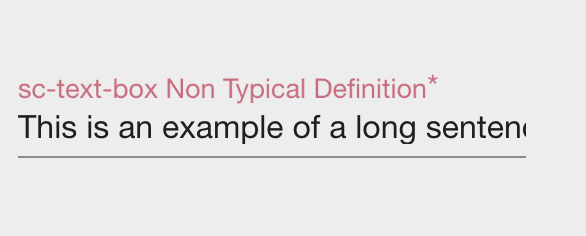
Resulting sc-text-box field on the form after entering a value:
This example illustrates that a value (shown below) exceeding the width of the field on the form can be entered, saved and viewed.
"This is an example of a long sentence that has been entered into a sc-text-box field on a form."
Resulting field in the document and database after saving the entered value:
"scTextBoxNonTypicalDefinition": "This is an example of a long sentence that has been entered into a sc-text-box field on a form."