sc-rich-text-editor
This document is a user guide for the sc-rich-text-editor component release version 7.1.26.

1 Purpose
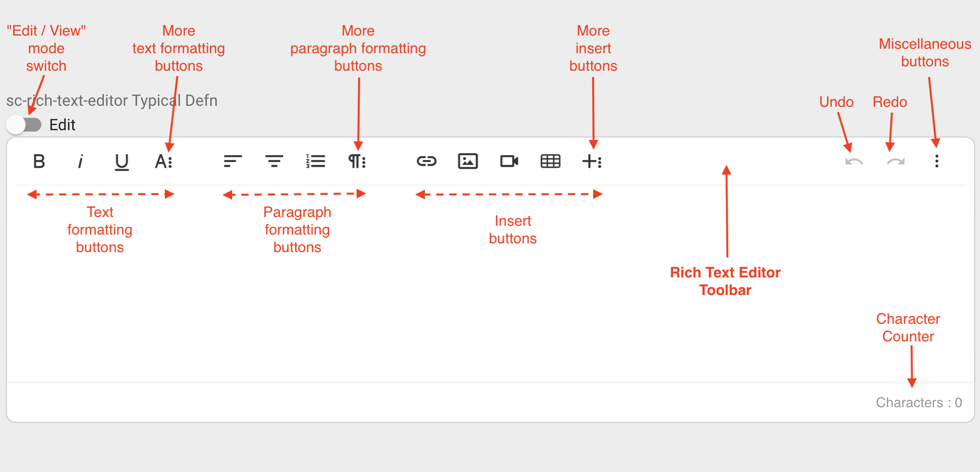
sc-rich-text-editor is a WYSIWYG HTML editor that enables rich text editing.
sc-rich-text-editor places a rich text editor field on a form that can be used in either edit or view mode.
Edit mode is for writing and editing text. On save, entered text will be saved with HTML like markup in the document.
View mode converts the saved text for html display.
A character counter displays the total number of characters entered.
The rich text editor toolbar provides buttons to format text, format paragraphs, insert items and other miscellaneous functions.
On mouseover, a toolbar button displays tooltip help e.g. on mouseover, the "Bold" button displays as:
![]()
Clicking the![]() button will reveal more "Text formatting" buttons:
button will reveal more "Text formatting" buttons:

Clicking the![]() button will reveal more "Paragraph formatting" buttons:
button will reveal more "Paragraph formatting" buttons:

Clicking the![]() button will reveal more "Insert" buttons:
button will reveal more "Insert" buttons:

Clicking the![]() button will reveal the "Miscelleanous" buttons:
button will reveal the "Miscelleanous" buttons:

On smaller and smaller screens, more and more toolbar buttons are hidden. On the smallest screens, all toolbar buttons may become hidden.

The sc-rich-text-editor definition provides fields for setting the properties of a rich text editor field and is fully described below.
2 Definition
sc-rich-text-editor is defined by a set of name/value pair fields consisting of:
- Required system fields.
- Required customizable fields.
- Optional customizable fields.
Note:
- Default values for fields described in the tables below are shown in bold text.
2.1 Required System Fields
| Field | Valid Values | Description |
|---|---|---|
| componentName | sc-rich-text-editor | The component name. Example: "componentName": "sc-rich-text-editor" |
2.2 Required Customizable Fields
| Field | Valid Values | Description |
|---|---|---|
| name | Any value written in camel case. | Defines the name of the rich text editor field in the document and database. Example: "name": "scRichTextEditorTypicalDefn" |
2.3 Optional Customizable Fields
| Field | Valid Values | Description |
|---|---|---|
| defaultValue | Any value | The value to initially load in the rich text editor field. Example: "defaultValue": "Apple" |
| Defaults to no value is initially loaded. | ||
| disableSave | true | Changing the rich text editor field value (e.g. entering or editing text) does not trigger the Save icon to flash. Exiting the form without saving changes to the rich text editor field value does not trigger a warning message to display. In the Angular version of the sc-rich-text-editor component, clicking the Save icon will not save the rich text editor field value to the document.In the AngularJS version of the sc-rich-text-editor component, clicking the Save icon will save the rich text editor field value to the document.Example: "disableSave": true |
| false | Default value. Changing the rich text editor field value (e.g. entering or editing text) does trigger the Save icon to flash. Exiting the form without saving changes to the rich text editor field value does trigger a warning message to display. In both the Angular and AngularJS versions of the sc-rich-text-editor component, clicking the Save icon will save the rich text editor field value to the document. |
|
| displayMode | dynamic | Default value. Does not need to be defined. Component will automatically open in edit mode until some edits have been saved to the component. The component will then open in view mode by default. |
| edit | Sets the component to edit mode, which allows the user to enter rich text | |
| editOnly | Additional to edit mode, the toggle toggle is hiddne. Component only allows user to enter rich text. | |
| view | Sets the display mode to view. Which puts the component into view mode to view the entered rich text. | |
| viewOnly | Building on view mode, the control toggle is hidden. Component only allows user to view the entered rich text. Example: "displayMode": "viewOnly" |
|
| enabled | false | The rich text editor field displays its value in View mode. The "View/Edit" switch is hidden. The rich text editor field is greyed out. A Stop icon appears on mouseover of the rich text editor field. A value cannot be entered or edited in the rich text editor field. Example: "enabled": false |
| true | Default value. The rich text editor field displays its value in View mode. The "View/Edit" switch is visible and enabled. The rich text editor field is not greyed out. A Stop icon does not appear on mouseover of the rich text editorr field. A value can be entered or edited in the rich text editor field. |
|
| fullWidth | true | The rich text editor field displays full width on the form. Example: "fullWidth": true |
| false | Default value. The rich text editor field does not display full width on the form. |
|
| label | Any value | Defines the name of the rich text editor field on the form i.e. the field label. Example: "label": "sc-rich-text-editor Typical Defn |
| Defaults to the rich text editor field displays without a field label on the form. | ||
| mandatory | true | The rich text editor field displays as mandatory (i.e. label in red text with an asterisk). Saving without a value, a message prompts the user to enter a value for the rich text editor field. Example: "mandatory": true |
| false | Default value. The field displays as optional (i.e. label in black text). |
|
| richTextOptions | Set of name/value fields | A set of name/value pairs, each defining a rich text editor field property. Section 2.4 richTextOptions Field lists and describes each of these name/value pair fields. |
| visible | false | The rich text editor field is not visible on the form. Example: "visible": false |
| true | Default value. The rich text editor field is visible on the form. |
2.4 richTextOptions Field
2.4.1 Optional Customizable Fields
The richTextOptions field listed in section 2.3 Optional Customizable Fields is a set of name/value pairs, each defining a rich text editor field property. This section lists and describes each of these name value pair fields (currently only one).
| Field | Valid Values | Description |
|---|---|---|
| toolbarSticky | Defines the behaviour of the sc-rich-text-editor toolbar for the following scenario.Scenario: 1. Scroll a form containing a rich text editor field downwards until the field's toolbar is out of view but its text entry area is still in view. 2. Click inside the text entry area. |
|
| true | For the scenario above, the sc-rich-text-editor toolbar buttons will automatically display elsewhere on the page, either in the page address bar or vertically down the side of the page.Example: "toolbarSticky": true |
|
| false | Default value (recommended). For the scenario above, the sc-rich-text-editor toolbar buttons are not automatically displayed elsewhere on the page. To access the sc-rich-text-editor toolbar buttons, the user will need to scroll upwards until the toolbar buttons comes back into view. |
3 Typical Definition
Below is a typical sc-rich-text-editor definition, defined with its required fields plus any optional field whose value is typically other than its default value.
        {
            "componentName": "sc-rich-text-editor",
            "name": "scRichTextEditorTypicalDefn",
            "fullWidth": true,
            "label": "sc-rich-text-editor Typical Defn"
        }
One or more of the optional fields shown below can be included in the above definition should a value other than their default value be required.
            "defaultValue": "Apple",
            "disableSave": false,
            "enabled": true,
            "mandatory": false,
            "richTextOptions": {
                "toolbarSticky": true
            },
            "visible": true,
4 Examples
Example 1
A sc-rich-text-editor definition defined with the typically needed fields.
        {
            "componentName": "sc-rich-text-editor",
            "name": "scRichTextEditorTypicalDefn",
            "fullWidth": true,
            "label": "sc-rich-text-editor Typical Defn"
        }
Resulting sc-rich-text-editor field on the form:
The character count can be seen in the bottom left corner of the sc-rich-text-editor field.

Resulting sc-rich-text-editor field on the form after entering but before saving a value:
This example shows a form displaying a sc-rich-text-editor field in Edit mode with:
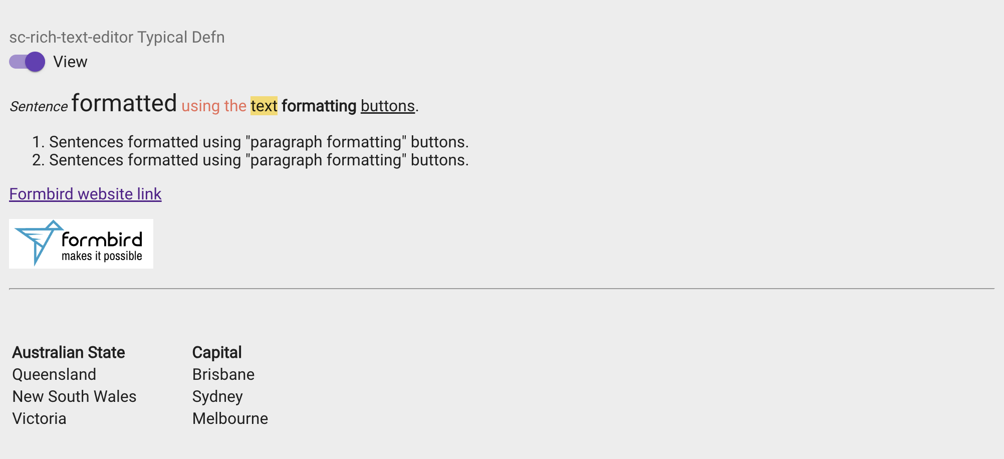
- A sentence formatted using text formatting buttons: "italic", "font size", "text color", "background color", "bold" and "underline".
- A paragraph formatted using paragraph formatting button: "ordered list"
- A Formbird website link inserted using "Insert Link" button.
- The Formbird Logo image inserted using "Insert Image" button.
- A horizontal line inserted using "Insert Horizontal Line" button.
- A table inserted using "Insert Table" button.

Resulting sc-rich-text-editor field on the form after saving the entered value:

Resulting sc-rich-text-editor field in the document and database after saving the entered value:
"scRichTextEditorTypicalDefn": "<p><em><span style=\"font-size: 14px;\">Sentence</span></em> <span style=\"font-size: 24px;\">formatted</span> <span style=\"color: rgb(235, 107, 86);\">using the</span> <span style=\"background-color: rgb(247, 218, 100);\">text</span> <strong>formatting</strong> <u>buttons</u>.</p><ol><li style=\"text-align: left;\">Sentences formatted using "paragraph formatting" buttons.</li><li id=\"isPasted\">Sentences formatted using "paragraph formatting" buttons.</li></ol><p><a href=\"https://www.formbird.com/\">Formbird website link</a></p><p style=\"text-align: left;\"><img class=\"fr-dib fr-fil\" src=\"https://comp-dev-ng.formbird.com/api/getFile/70e9c160-1c90-11ee-8f27-8fb90975070e\" style=\"width: 144px;\"></p><hr><p><br></p><table style=\"width: 36%; margin-right: calc(64%);\"><thead><tr><th class=\"fr-thick\" style=\"text-align: left; width: 50.7375%;\">Australian State</th><th class=\"fr-thick\" style=\"text-align: left; width: 48.6725%;\">Capital</th></tr></thead><tbody><tr><td class=\"fr-thick\" style=\"width: 50.7375%;\">Queensland</td><td class=\"fr-thick\" style=\"width: 48.6725%;\">Brisbane</td></tr><tr><td style=\"width: 50.7375%;\">New South Wales</td><td class=\"fr-thick\" style=\"width: 48.6725%;\">Sydney</td></tr><tr><td class=\"fr-thick\" style=\"width: 50.7375%;\">Victoria</td><td class=\"fr-thick\" style=\"width: 48.6725%;\">Melbourne</td></tr></tbody></table>"
