sc-panel-collapse
This document is a user guide for the sc-panel-collapse component release version 7.1.23

sc-panel-collapse field in a collapsed state

sc-panel-collapse field in an expanded state
1 Purpose
The sc-panel-collapse component places one or more Formbird components wrapped inside a collapsible panel field on a form.
By default, a sc-panel-collapse panel field is collapsible, displays in a collapsed state hiding its contents and showing an "Expand" button  in the panel heading bar.
Clicking the "Expand" button will display the panel in an expanded state showing its contents and a "Collapse" button  in the panel heading bar.
Collapsible panels can simplify a form by hiding the panel content until it is needed.
That said, the sc-panel-collapse component can be defined as non-collapsible. A non-collapsible panel displays in an expanded state and does show an "Expand/Collapse" button in the panel heading bar.
Note:
- The
sc-panelandsc-static-htmlcomponents can also be used to place a panel field on a form. User guides for these components can be found at formbird.com. sc-panelandsc-panel-collapseare defined by the same set of fields and can be defined to behave in the same way. Where they differ is:- The
sc-panel-collapsefield is collapsible by default. - The a
sc-panelfield is non-collapsible by default. - The default values and behaviour of the
"collapsible"and"wrapPanelCollapsed"fields.
- The
The sc-panel-collapse component definition provides fields for setting the properties of a sc-panel-collapse field and is fully described below.
2 Definition
To place a sc-panel-collapse panel field on a form requires:
- A
sc-panel-collapsedefinition to open panel wrapping . - Followed by the definitions of the Formbird components to be wrapped inside the panel (i.e. the panel content) .
- Followed by a
sc-panel-collapsedefinition to close panel wrapping.
sc-panel-collapse is defined by a set of name/value pair fields consisting of:
- Required system fields
- Required customizable fields
- Optional customizable fields
Note:
- Default values for fields described in the tables below are shown in bold text.
2.1 Required System Fields
| Field | Valid Values | Description |
|---|---|---|
| componentName | Needs to be specified in both the sc-panel-collapse definition that opens panel wrapping and in the sc-panel-collapse definition that closes panel wrapping. |
|
| sc-panel-collapse | The component name. Example: "componentName": "sc-panel-collapse" |
2.2 Required Customizable Fields
| Field | Valid Values | Description |
|---|---|---|
| name | Needs to be specified in both the sc-panel-collapse definition that opens panel wrapping and in the sc-panel-collapse definition that closes panel wrapping. |
|
| Any value written in camel case. | Defines the name of the sc-panel-collapse field in the document and database.Example: `"name": "scPanelTypicalDefinition" |
|
| wrapAction | Needs to be specified in both the sc-panel-collapse definition that opens panel wrapping and in the sc-panel-collapse definition that closes panel wrapping. |
|
| open | Open the wrapping of one of more Formbird components in a panel. Example: "wrapAction": "open" |
|
| close | Close the wrapping of one of more Formbird components in a panel. Example: "wrapAction": "close" |
2.3 Optional Customizable Fields
Note:
Except for the wrapHtmlType field, the optional customizable fields in the table below need only to be specified in the sc-panel-collapse definition that opens panel wrapping. Whereas thewrapHtmlType field needs to be specified in both the sc-panel-collapse definition that opens panel wrapping and in the sc-panel-collapse definition that closes panel wrapping.
| Field | Valid Values | Description |
|---|---|---|
| allowFullBarSelection | true | The "allowFullBarSelection" and the "collapsible" fields work together to determine if clicking the panel heading bar will expand a collapsed panel and collapse an expanded panel.Both fields must be defined as "true" to provide the panel heading bar with this feature. Example: "allowFullBarSelection": true,"collapsible": true |
| false | Default value. Clicking the panel heading bar does not expand a collapsed panel and does not collapse an expanded panel. |
|
| collapsible | The "collapsible" and "wrapPanelCollapsed" fields work together to determine if (1) the panel displays collapsed or expanded and (2) the panel heading bar displays an "Expand" button or a "Collapse" button or neither of these buttons. |
|
| false | When "collapsible": false, the panel behaviour is dependent on how the "wrapPanelCollapsed" field is defined.If "wrapPanelCollapsed" is:
Example: "collapsible": false |
|
| true | Default value. When "collapsible": true or the "collapsible" field defaults to true, the, panel behaviour is dependent on how the "wrapPanelCollapsed" field is defined.If "wrapPanelCollapsed" is:
Example: "collapsible": true |
|
| enabled | false | Disables the "Expand/Collapse" button, "Link Text" field and "Link Icon" field if any are defined to display on the panel heading bar. Display a Stop icon on mouseover of the "Expand/Collapse" button, "Link Text" field and "Link Icon" field. When defined by the "allowFullBarSelection" and the "collapsible" fields, the ability to expand/collapse a panel by clicking the panel heading bar is disabled.Example: "enabled": falseNote: Changing the enabled state of the panel does not flow through to the components wrapped inside the panel i.e. the enabled state of each component wrapped inside the panel is set by their respective enabled fields. |
| true | Default value. Does not disable the "Expand/Collapse" button, "Link Text" field, "Link Icon" field if any are defined to display on the panel heading bar. Does not display a Stop icon on mouseover of the "Expand/Collapse" button, "Link Text" field and "Link Icon" field. When defined by the "allowFullBarSelection" and the "collapsible" fields, the ability to expand/collapse a panel by clicking the panel heading bar is not disabled. |
|
| fullWidth | true | The panel field displays full width on the form."fullWidth": true |
| false | Default value. The panel field does not display full width on the form. |
|
| label | Any value | Defines the name of the sc-panel-collapse field on the form i.e. the field label. The field label is displayed left justified in the panel heading bar.Example: "label": "sc-panel-collapse Typical Definition" |
Defaults to the sc-panel-collapse field displays without a field label on the form i.e. the panel heading bar is displayed without a field label. |
||
| linkIcon | The "linkIcon", "linkText", "overrideTemplate", "url" and "urlOpenIn" fields provide the ability to include a link field in the panel heading bar.The "linkIcon" and/or the "linkText" field are used to define the appearance of the link field.The "overrideTemplate" or the "url" field are used to define the target of the link.The "overrideTemplate" field is used to define how the target of the link field will display e.g. in a popup. |
|
| A valid Angular Material Icon name | The icon to display as a link field and positioned about 30px to the right of the link text in the panel heading bar. If "linkText" field is not defined then the link icon is positioned about 30px to the right of the panel label. On mouseover of the link icon, the cursor changes to a hand pointer  . Clicking the link icon will open the the target of the link, assuming the target of the link has been defined by either the . Clicking the link icon will open the the target of the link, assuming the target of the link has been defined by either the "overrideTemplate" or the "url" field.Example: Display the Open Browser Icon  . ."linkIcon": "open_in_browser"Note:
|
|
| Defaults to no link icon is displayed in the panel heading bar. | ||
| linkText | The "linkIcon", "linkText", "overrideTemplate", "url" and "urlOpenIn" fields provide the ability to include a link field in the panel heading bar.The "linkIcon" and/or the "linkText" field are used to define the appearance of the link field.The "overrideTemplate" or the "url" field are used to define the target of the link.The "overrideTemplate" field is used to define how the target of the link field will display e.g. in a popup. |
|
| Text value | The text to display as a link field and positioned about 30px to the right of the panel label in the panel heading bar. The cursor changes to a hand pointer on mouseover of the link text. Clicking the link text will open the the target of the link, assuming the target of the link has been defined by either the "overrideTemplate" or the "url" field.Example: "linkText": "Formbird Makes it Possible" |
|
| Defaults to no link text is displayed in the panel heading bar. | ||
| overrideTemplate | The "linkIcon", "linkText", "overrideTemplate", "url" and "urlOpenIn" fields provide the ability to include a link field in the panel heading bar.The "linkIcon" and/or the "linkText" field are used to define the appearance of the link field.The "overrideTemplate" or the "url" field are used to define the target of the link.The "overrideTemplate" field is used to define how the target of the link field will display e.g. in a popup. |
|
| Valid templateId | The concatenation of the current document URL and the "0verideTemplateId" value is used to define the target of a link field, assuming a link field has been defined by either the "linkIcon" and/or the "linkText" field.Example: "overrideTemplate": "72d38500-5de9-11eb-8762-9f1ae10bf111"Note: Either the "url" field or the "overrideTemplate" field, but not both, can be used to define the target of the link. If both are provided then "url" field will take presidence. If neither is defined then on clicking the link text or link icon, nothing will happen. |
|
Defaults to the "overrideTemplate" field is not defined. |
||
| url | The "linkIcon", "linkText", "overrideTemplate", "url" and "urlOpenIn" fields provide the ability to include a link field in the panel heading bar.The "linkIcon" and/or the "linkText" field are used to define the appearance of the link field.The "overrideTemplate" or the "url" field are used to define the target of the link.The "overrideTemplate" field is used to define how the target of the link field will display e.g. in a popup. |
|
| Valid url | Used to define the target of a link field i.e. the URL to open when the link field is clicked, assuming a link field has been defined by either the "linkIcon" and/or the "linkText" field.The URL is either relative to the current server or an absolute url with a https tag. Example: "url": "https://www.formbird.com"Note: Either the "url" field or the "overrideTemplate" field, but not both, can be used to define the target of the link. If both are provided then "url" field will take presidence. If neither is defined then on clicking the link text or link icon, nothing will happen. |
|
Defaults to the "url" field is not defined. |
||
| urlOpenIn | The "linkIcon", "linkText", "overrideTemplate", "url" and "urlOpenIn" fields provide the ability to include a link field in the panel heading bar.The "linkIcon" and/or the "linkText" field are used to define the appearance of the link field.The "overrideTemplate" or the "url" field are used to define the target of the link.The "overrideTemplate" field is used to define how the target of the link field will display e.g. in a popup. |
|
| newWindow | The target of the link field opens in a new browser window or tab (the browser determines whether its new tab or window). Example: "openIn": "newWindow" |
|
| overlay | Note: Only use when the target of the link field is an internal web address of a Formbird document i.e. do not use when the the target of the link field is an external web address. Opens a Formbird document in a popup window overlaying the current page. Example: "openIn": "overlay" |
|
| popup | The target of the link field opens in a browser pop-up. Example: "openIn": "popup" |
|
| currentWindow | Default value. The target of the link field opens opens in the current browser window or tab (the browser determines whether its new tab or window). Example: "openIn": "currentWindow" |
|
| visible | false | The panel field is not visible on the form. As the panel is hidden from view, all components wrapped inside the panel are also hidden from view. Example: "visible": falseNote: Changing the visible state of the panel does not flow through to the components wrapped inside the panel i.e. the visible state of each component wrapped inside the panel is set by their respective visible fields. |
| true | Default value. The collapsible panel field is visible on the form. |
|
| wrapClass | Defines the style of the panel heading (e.g. panel heading text colour and panel heading background colour) | |
| panel-primary | Panel heading colours: white text, blue background. Example: "wrapClass": "panel-primary" |
|
| panel-success | Panel heading colours: green text, light green background. Example: "wrapClass": "panel-success" |
|
| panel-info | Panel heading colours: blue text, light sky blue background. Example: "wrapClass": "panel-info" |
|
| panel-warning | Panel heading colours: brown text, light yellow background. Example: "wrapClass": "panel-warning" |
|
| panel-danger | Panel heading colours: red text, light red background. Example: "wrapClass": "panel-danger" |
|
| panel-default | Default value. Panel heading colours: black text, light grey background.  Example: "wrapClass": "panel-default" |
|
| User defined panel style | Alternatively, the "wrapClass" value can be a user defined style. Example: "wrapClass": "panel-A"where panel-A is the name of a style defined by the user within the template as: {"componentName": "sc-static-html","name": "stylePanelA","fullWidth": true,"html": "<style> .panel-A {background:#fffff;box-shadow: 10px 10px 5px grey;} .panel-A > .panel-heading {background:#6a99f4;color:white;font-size:1.25em;font-weight:200;padding:1px 1px 1px 10px} .panel-A > .panel-body {margin:none;} .form-group {margin: 20px 0 0 0 !important;}</style>"} |
|
| wrapHeading | false | Hide the panel heading bar. Example: "wrapHeading": false |
| true | Default value. Show the panel heading bar. |
|
| wrapHeadingBackground | Colour name or Hex value | Overrides the "wrapClass" field's heading background colour.Examples: "wrapHeadingBackground": "yellow""wrapHeadingBackground": "#FFFF00" |
Defaults to the "wrapClass" field's heading background colour. |
||
| wrapHeadingColor | Colour name or Hex value | Overrides the "wrapClass" field's heading text colour.Examples: "wrapHeadingColor": "darkRed""wrapHeadingColor": "#8B0000" |
Defaults to the "wrapClass" field's heading text colour. |
||
| wrapHtmlType | Needs to be specified in both the sc-panel-collapse definition that opens panel wrapping and in the sc-panel-collapse definition that closes panel wrapping. |
|
| wrap | Wrap one or more Formbird components inside a panel. Example: "wrapHtmlType": "wrap" |
|
| noWrap | Default value. Do not wrap the Formbird components inside a panel. |
|
| wrapPanelCollapsed | The "collapsible" and "wrapPanelCollapsed" fields work together to determine if (1) the panel displays collapsed or expanded and (2) the panel heading bar displays an "Expand" button or a "Collapse" button or neither of these buttons. |
|
| true | When "wrapPanelCollapsed": true, panel behaviour is dependent on how the "collapsible" field is defined.If "collapsible" is:
Example: "wrapPanelCollapsed": true |
|
| false | When "wrapPanelCollapsed": false, panel behaviour is dependent on how the "collapsible" field is defined.If "collapsible" is:
Example: "wrapPanelCollapsed": false |
|
When "wrapPanelCollapsed" is not defined then panel behaviour is dependent on how the "collapsible" field is defined.If "collapsible" is:
|
3 Typical Definition
Below is a typical sc-panel-collapse definition, defined with its required fields plus any optional field whose value is typically other than its default value.
        {
            "componentName": "sc-panel-collapse",
            "name": "scPanelTypicalDefinition",
            "label": "sc-panel-collapse Typical Definition",
            "wrapAction": "open",
            "wrapHtmlType": "wrap",
            "fullWidth": true
        },

INSERT one or more component definitions here

        {
            "componentName": "sc-panel-collapse",
            "name": "scPanelTypicalDefinition",
            "wrapAction": "close",
            "wrapHtmlType": "wrap"
        }
One or more of the optional fields shown below can be included sc-panel-collapse component definition used to open the panel, should a value other than their default value be required.
            "allowFullBarSelection": true,
            "collapsible": false,
            "enabled": false,
            "linkIcon": "open_in_browser",
            "linkText": "Formbird Makes it Possible",
            "overrideTemplate": "72d38500-5de9-11eb-8762-9f1ae10bf111",
            "url": "/form/34eaf970-6add-11e6-a8ec-73bc02e91916",
            "url": "https://www.formbird.com",
            "urlOpenIn": "newWindow",
            "visible": false,
            "wrapClass": "panel-primary",
            "wrapHeading": false,
            "wrapHeadingBackground": "yellow",
            "wrapHeadingColor": "darkRed",
            "wrapPanelCollapsed": false,
4 Examples
Example 1
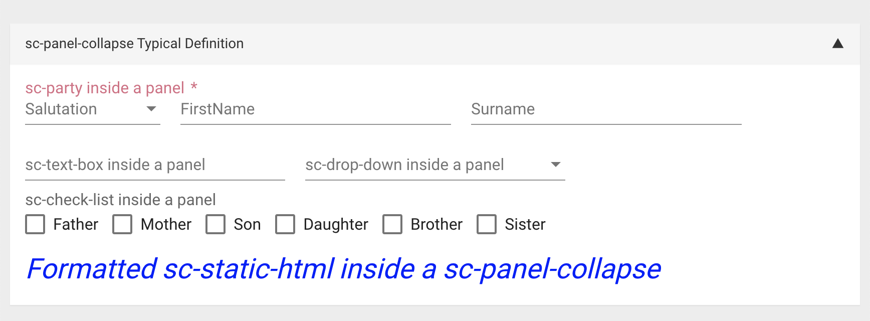
Five Formbird components wrapped inside a panel defined by two sc-panel-collapse definitions (one to open the panel and one to close the panel ), each defined with their typically needed fields.
        {
            "componentName": "sc-panel-collapse",
            "name": "scPanelTypicalDefinition",
            "wrapAction": "open",
            "fullWidth": true,
            "label": "sc-panel-collapse Typical Definition",
            "wrapHtmlType": "wrap"
        },
        {
            "componentName": "sc-party",
            "fullWidth": true,
            "label": "sc-party 1",
            "name": "scParty1",
            "mandatory": true
        },
        {
            "componentName": "sc-text-box",
            "name": "TextBox1",
            "label": "Text Box 1"
        },
        {
            "componentName": "sc-drop-down",
            "label": "sc-drop-down 1",
            "name": "ScDropDown1",
            "dropDownList": [
                "Less than 1 year",
                "1 to 12 years",
                "13 to 19 years",
                "Over 19 years"
            ]
        },
        {
            "componentName": "sc-check-list",
            "name": "scCheckList1",
            "label": "sc-check-list 1",
            "list": [
                "Father",
                "Mother",
                "Son",
                "Daughter",
                "Brother",
                "Sister"
            ],
            "fullWidth": true
        },
        {
            "componentName": "sc-static-html",
            "fullWidth": true,
            "html": "<div style='font-weight:normal;font-style:italic;font-size:2.0em;color:blue;'> Formatted sc-static-html within a sc-panel-collapse</div>"
        },
        {
            "componentName": "sc-panel-collapse",
            "name": "scPanelTypicalDefinition",
            "wrapAction": "close",
            "wrapHtmlType": "wrap"
        },
Resulting panel field on the form:
Resulting panel on the form after expanded the panel:
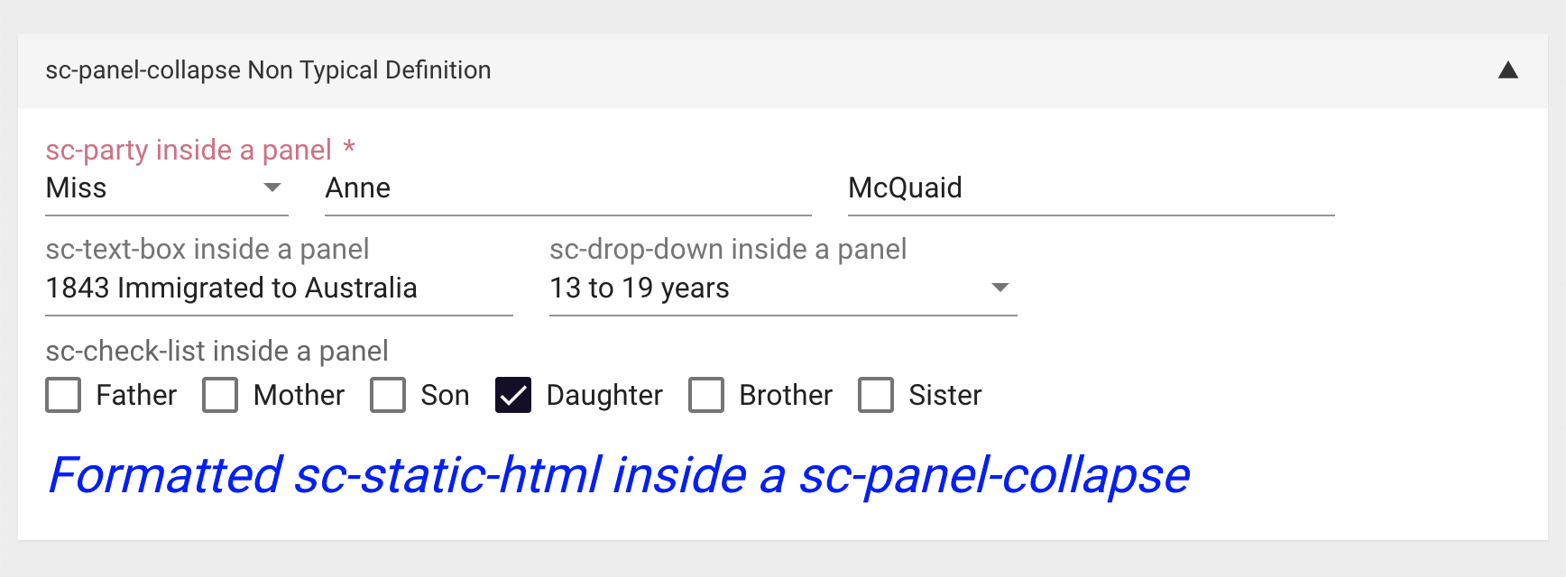
Resulting panel on the form after entering values for the fields wrapped inside the panel:
Resulting fields in document and database after saving the values entered inside the panel:
    "scParty2": {
        "title": "Miss",
        "firstName": "Anne",
        "surname": "McQuaid"
    },
    "textBox2": "1843 Immigrated to Australia",
    "scDropDown2": "13 to 19 years",
    "scCheckList2": [
        "Daughter"
    ]
Example 2
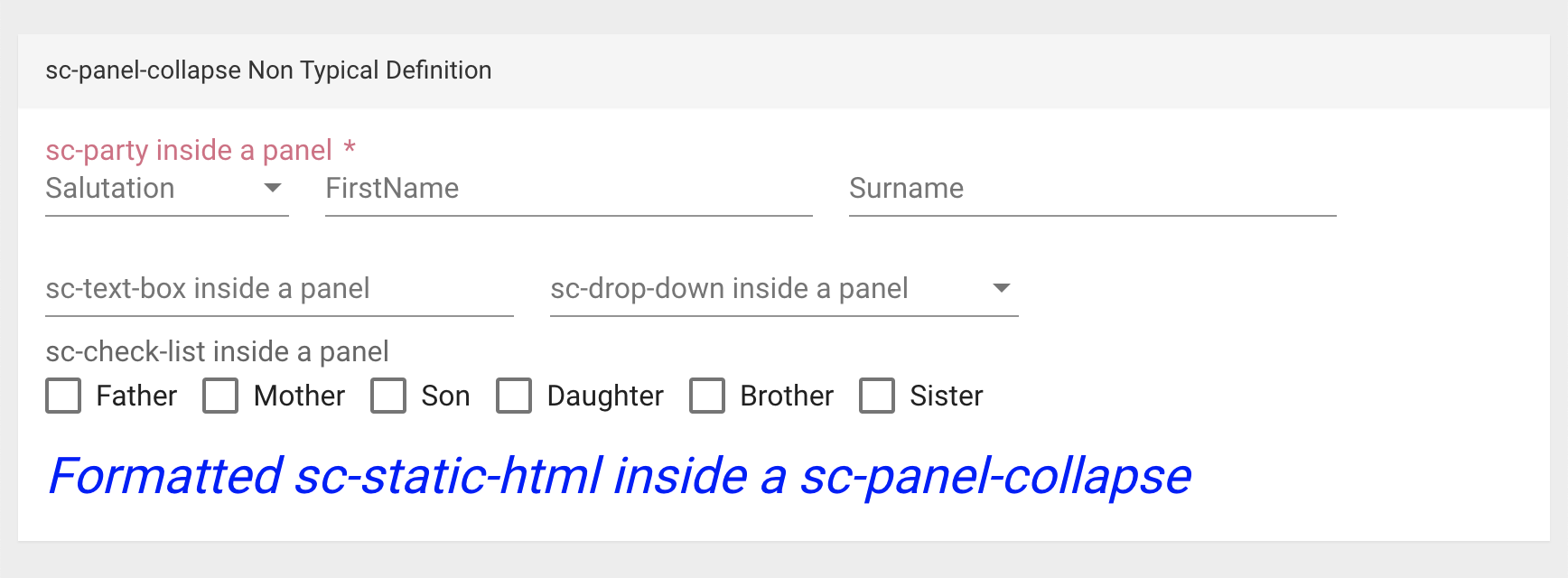
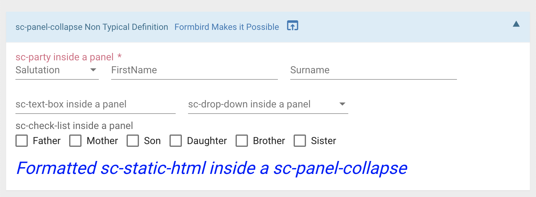
Five Formbird components wrapped inside a panel defined by two sc-panel-collapse definitions (one to open the panel and one to close the panel), each defined with their typically needed fields plus the following optional fields included in the open panel definition:
- The
"linkText"field to display the text ""Formbird Makes it Possible" icon as a link field in the panel heading bar. - The
"linkIcon"field to display the "open Browser" icon as a link field in the panel heading bar. - The
"url"field defining the target for the above link fields. - The
"urlOpenIn"field to open the target of the link fields in pop-up. - The
"wrapClass"field to format the panel heading colours as blue text on a light sky blue background.
        {
            "componentName": "sc-panel-collapse",
            "name": "scPanelNonTypicalDefinition",
            "label": "sc-panel-collapse Non Typical Definition",
            "wrapAction": "open",
            "wrapHtmlType": "wrap",
            "fullWidth": true,
            "linkIcon": "open_in_browser",
            "linkText": "Formbird Makes it Possible",
            "url": "https://www.formbird.com",
            "urlOpenIn": "popup",
            "wrapClass": "panel-info"
        },
        {
            "componentName": "sc-party",
            "name": "scParty2",
            "label": "sc-party inside a panel",
            "fullWidth": true,
            "mandatory": true
        },
        {
            "componentName": "sc-text-box",
            "name": "textBox2",
            "label": "sc-text-box inside a panel"
        },
        {
            "componentName": "sc-drop-down",
            "label": "sc-drop-down inside a panel",
            "name": "scDropDown2",
            "dropDownList": [
                "Less than 1 year",
                "1 to 12 years",
                "13 to 19 years",
                "Over 19 years"
            ]
        },
        {
            "componentName": "sc-check-list",
            "name": "scCheckList2",
            "label": "sc-check-list inside a panel",
            "list": [
                "Father",
                "Mother",
                "Son",
                "Daughter",
                "Brother",
                "Sister"
            ],
            "fullWidth": true
        },
        {
            "componentName": "sc-static-html",
            "fullWidth": true,
            "html": "<div style='font-weight:normal;font-style:italic;font-size:2.0em;color:blue;'> Formatted sc-static-html inside a sc-panel-collapse</div>"
        },
        {
            "componentName": "sc-panel-collapse",
            "name": "scPanelNonTypicalDefinition",
            "wrapAction": "close",
            "wrapHtmlType": "wrap"
        },
Resulting panel field on the form:

Resulting panel field after clicking the "Expand" button to expand the panel and show its contents:
Resulting panel field after clicking either the link text or link icon field to open the target of the link in a pop-up:
