sc-drop-down
This document is a user guide for the sc-drop-down component version 6.5.84.


1 Purpose
sc-drop-down places a drop down field on a form, allowing the user to select one value from a list of valid values.
However sc-drop-down can be configured to allow the user to select multiple values from a list of valid values.
The sc-drop-down definition provides fields for setting the properties of a drop down field and is fully described below.
2 Definition
sc-drop-down is defined by a set of name/value pair fields consisting of:
- Required system fields
- Required customizable fields
- Optional customizable fields
Note:
- Default values for fields described in the tables below are shown in bold text.
2.1 Required System Fields
| Field | Valid Values | Description |
|---|---|---|
| componentName | sc-drop-down | The component name. Example: "componentName": "sc-drop-down" |
2.2 Required Customizable Fields
| Field | Valid Values | Description |
|---|---|---|
| dropDownList | Any value(s) | An array of one or more values. Clicking the sc-drop-down field will display a selection list of these values. Example: "dropDownList": ["Father","Mother","Son","Daughter","Brother","Sister",] |
| name | Any value written in camel case. | Defines the name of the sc-drop-down field in the document and database. Example: "name": "typicalDefnScDropDown" |
2.3 Optional Customizable Fields
| Field | Valid Values | Description |
|---|---|---|
| defaultValue | A listed valid value. | The sc-drop-down field displays on the form with the default value selected. Example: "defaultValue": "Mother"Note: If sc-drop-down is defined with "multiSelect": true then the default value is written as an of array of one or more of the valid values.Example: "defaultValue": ["Mother"]Example: "defaultValue": ["Mother","Daughter"] |
| Defaults to no value is initially selected. | ||
| disableSave | true | Changing the sc-drop-down field value (i.e. selecting, deselecting or selecting a different drop down value) does not trigger the Save icon to flash. Exiting the form without saving changes to the sc-drop-down field value does not trigger a warning message to display. In the Angular version of the sc-drop-down component, clicking the Save icon will not save the sc-drop-down field value to the document. In the AngularJS version of the sc-drop-down component, clicking the Save icon will save the sc-drop-down field value to the document. Example: "disableSave": true |
| false | Default value. Changing the sc-drop-down field value (i.e. selecting, deselecting or selecting a different drop down value) does trigger the Save icon to flash. Exiting the form without saving changes to the sc-drop-down field value does trigger a warning message to display. In both the Angular and AngularJS versions of the sc-drop-down component, clicking the Save icon will save the sc-drop-down field value to the document. |
|
| enabled | false | The sc-drop-down field on the form is greyed out. A Stop icon appears on mouseover of the sc-drop-down field. A sc-drop-down field value cannot be selected. Example: "enabled": false |
| true | Default value. The sc-drop-down field on the form is not greyed out. A Stop icon does not appear on mouseover of the sc-drop-down field. A sc-drop-down field value can be selected. |
|
| fullWidth | true | The sc-drop-down field displays full width on the form. Example: "fullWidth": true |
| label | Any value | Defines the name of the sc-drop-down field on the form i.e. the field label. Example: "label": "Typical Defn sc-drop-down" |
| Defaults to the sc-drop-down field displays without a field label on the form. | ||
| Defaults to the sc-drop-down field displays on the form without a field label. | ||
| mandatory | true | The sc-drop-down field displays as mandatory (i.e. label in red text with an asterisk). Saving without selecting a sc-drop-down field value, a message prompts the user to select a value for the sc-drop-down field. Example: "mandatory": true |
| false | Default value. The sc-drop-down field displays as optional (i.e. label in black text). Saving without selecting a sc-drop-down field value, a message does not prompt the user to select a value for sc-drop-down field. |
|
| multiSelect | true | Multiple options can be selected from the drop down list. Example: "multiSelect": trueNote The Formbird search function uses Elastic Search. Elastic Search creates an index based on the name of the component and assigns a data type to the name on the first save of a document.The default data type for the sc-drop-down component is 'string' if "multiSelect":true has not been specified. If "multiSelect":true is added to the component after a document has been saved, this will change the data type to 'array' which will cause a data type clash in the index. The same is true if changing from "multiSelect":true to "multiSelect":false (or deleting the parameter from the component definition).In these instances, the field should be renamed to avoid the clash. |
| false | Default value. Multiple options cannot be selected from the drop down list. |
|
| visible | false | The sc-drop-down field is not visible on the form. Example: "visible": false |
| true | Default value. The sc-drop-down field is visible on the form. |
3 Typical Definition
Below is a typical sc-drop-down definition, defined with its required fields plus any optional field whose value is typically other than its default value.
{
    "componentName": "sc-drop-down",
    "label": "Typical Defn sc-drop-down",
    "name": "typicalDefnScDropDown",
    "dropDownList": [
        "Father",
        "Mother",
        "Son",
        "Daughter",
        "Brother",
        "Sister"
    ]
}
One or more of the optional fields shown below can be included in the above definition should a value other than their default value be required.
Note:
If "multiSelect": false then define "defaultValue" as a string value.
If "multiSelect": true then define "defaultValue" as an array of one or more string values.
    "defaultValue": "Mother",
    "defaultValue": [
        "Mother",
        "Daughter"
    ],
    "disableSave":true,
    "enabled":false,
    "fullWidth":true,
    "mandatory": true,
    "multiSelect": true,
    "visible":false
4 Examples
Example 1
A sc-drop-down definition defined with the typically needed fields.
{
    "componentName": "sc-drop-down",
    "name": "typicalDefnScDropDown",
    "label": "Typical Defn sc-drop-down",
    "dropDownList": [
        "Father",
        "Mother",
        "Son",
        "Daughter",
        "Brother",
        "Sister"
    ]
}
Resulting field on the form:

Resulting fields on the form after clicking the sc-drop-down field:
Clicking the sc-drop-down field will display a scollable list of values. In this example, the user would scroll down to see the value 'Sister'.
Resulting fields on the form after selecting a drop down value:

Resulting field in document and database after saving the selected drop down value:
"typicalDefnScDropDown": "Daughter"
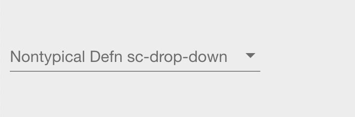
Example 2
A sc-drop-down definition defined with the typically needed fields plus "multiSelect": true.
{
    "componentName": "sc-drop-down",
    "name": "typicalDefnScDropDown",
    "label": "Typical Defn sc-drop-down",
    "dropDownList": [
        "Father",
        "Mother",
        "Son",
        "Daughter",
        "Brother",
        "Sister"
    ],
    "multiSelect": true
}
Resulting field on the form:
Resulting field on the form after clicking the sc-drop-down field:
Clicking the sc-drop-down field will display a scollable list of values. In this example, the user would scroll down to see the value 'Sister'.
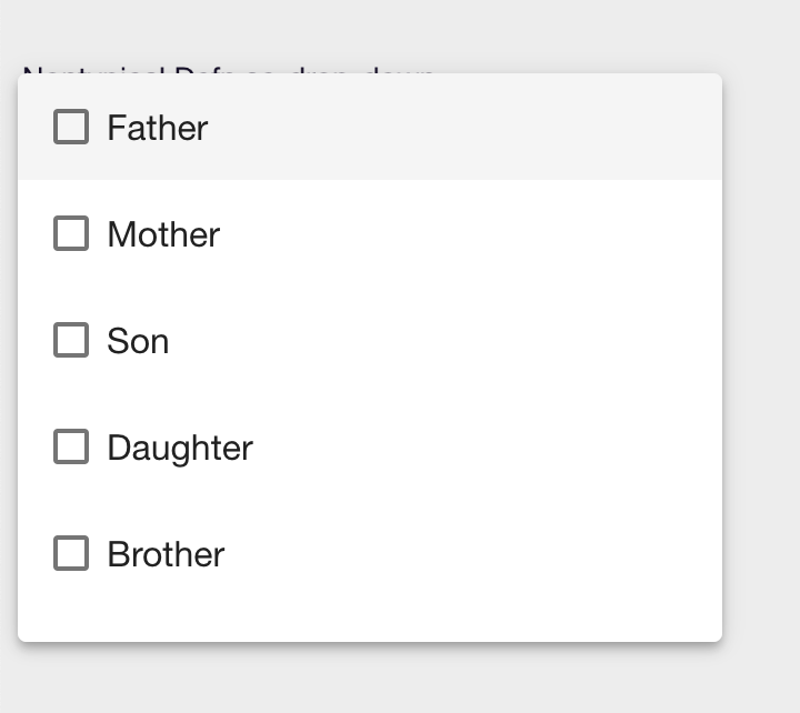
Resulting field on the form on selecting 3 values:
Clicking a value will select it and tick its checkbox, clicking it again would deselect it and untick its checkbox.
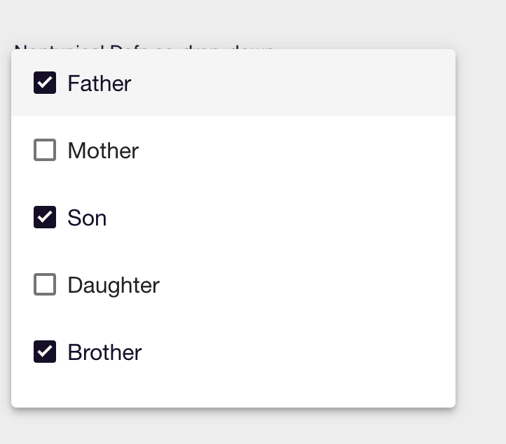
Resulting field on the form after selecting 3 values:
Clicking anywhere on the form will close the list of values and display the selected values in the sc-drop-down field.
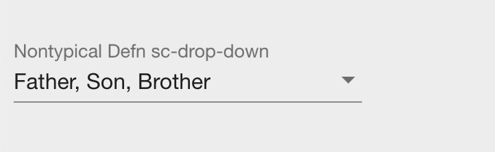
Resulting field in document and database after saving the selected values:
    "nonTypicalDefnScDropDown": [
        "Father",
        "Son",
        "Brother"
    ]