sc-drop-down-ex

1 Purpose
This document is a user guide for the sc-drop-down-ex component as of version 5.11.
sc-drop-down-ex places an extended drop down field on a form. A drop down extended field allows the user to select one value from a list where the list of values is dependent on the currently selected value.
The sc-drop-down-ex definition provides fields for setting the properties of an extended drop down and is fully described below.
2 Definition
sc-drop-down-ex is defined by a set of name/value pair fields consisting of:
- Required system fields
- Required customizable fields
- Optional customizable fields
Note:
- Default values for fields described in the tables below are shown in bold text.
2.1 Required System Fields
| Field | Valid Values | Description |
|---|---|---|
| componentName | sc-drop-down-ex | The component name. Example: "componentName": "sc-drop-down-ex" |
2.2 Required Customizable Fields
| Field | Valid Values | Description |
|---|---|---|
| dropDownExList | An array of values | An array of elements, each element having a parent value and an "item" array of its child values. However, the first element can have just the "item" array of child values. Clicking a drop down extended field will display the child values whose parent value is the currently selected value. If there is no currently selected value, then clicking the drop down extended list field will display the child values defined for the first element of the array. Example: See Example 1 below in Section 4 Examples. |
| name | Any value written in camel case. | Defines the name of the drop-down extended field in the document and database. Example: "name": "testScDropDownEx" |
2.3 Optional Customizable Fields
| Field | Valid Values | Description |
|---|---|---|
| defaultValue | One of the listed values. | The drop down extended field displays with the default value selected. Example: "defaultValue": "New" |
| Defaults to no value selected. | ||
| disableSave | true | Changing the sc-drop-down-ex field value (i.e. selecting or selecting a different a drop down value) does not trigger the Save icon to flash. Exiting the form without saving changes to the sc-drop-down-ex field value does not trigger a warning message to display. In the Angular version of the sc-drop-down-ex component, clicking the Save icon will not save the sc-drop-down-ex field value to the document. In the AngularJS version of the sc-drop-down-ex component, clicking the Save icon will save the sc-drop-down-ex field value to the document. Example: "disableSave": true |
| false | Default value. Changing the sc-drop-down-ex field value (i.e. selecting or selecting a different a drop down value) does trigger the Save icon to flash. Exiting the form without saving changes to the sc-drop-down-ex field value does trigger a warning message to display. In both the Angular and AngularJS versions of the sc-drop-down-ex component, clicking the Save icon will save the sc-drop-down-ex field value to the document. |
|
| enabled | false | The drop down extended field is greyed out. A Stop icon appears on mouseover. A drop down extended field value cannot be selected. Example: "enabled": false |
| true | Default value. The drop down extended field is not greyed out. A Stop icon does not appear on mouseover. A drop down extended field value can be selected. |
|
| fullWidth | true | The drop down extended field displays full width on the form. Example: "fullWidth": true |
| false | Default value. The drop down extended field does not display full width on the form. | |
| label | Any value | Defines the name of the drop down extended field on the form i.e. the field label. Example: "label": "Test sc-drop-down-ex" |
| Defaults to no field label is displayed. | ||
| mandatory | true | The drop down extended field displays as mandatory (i.e. label in red text with an asterisk). Saving without selecting a value, a message prompts the user to select a value for the drop down extended field. Example: mandatory": true |
| false | Default value. The drop down extended field displays as optional (i.e. label in black text). Saving without selecting a value, a message does not prompt the user to select a value for drop down extended field. |
|
| visible | false | The drop down extended field is not visible on the form. Example: "visible": false |
| true | Default value. The drop down extended field is visible on the form. |
3 Typical Definition
Below is a typical sc-drop-down-ex definition, defined with its required fields plus any optional field whose value is typically other than its default value.
{
    "name": "status",
    "label": "Request Status",
    "componentName": "sc-drop-down-ex",
    "defaultValue": "New",
    "dropDownExList": [
        {
            "item": [
                "New"
            ]
        },
        {
            "item": [
                "New",
                "In Progress"
            ],
            "parent": "New"
        },
        {
            "item": [
                "In Progress",
                "Work Complete",
                "Feedback"
            ],
            "parent": "In Progress"
        },
        {
            "item": [
                "Work Complete",
                "In Progress",
                "Closed"
            ],
            "parent": "Work Complete"
        },
        {
            "item": [
                "Feedback",
                "In Progress"
            ],
            "parent": "Feedback"
        },
        {
            "item": [
                "Closed"
            ],
            "parent": "Closed"
        }
    ]
}
One or more of the optional fields shown below can be included in the above definition should a value other than their default value be required.
    "mandatory": true,
    "disableSave":true,
    "enabled":false,
    "fullWidth":true,
    "visible":false,
4 Examples
Example 1
sc-drop-down-ex defined with the typically needed fields.
        {
            "componentName": "sc-drop-down-ex",
            "label": "Test sc-drop-down-ex",
            "name": "testScDropDownEx",
            "defaultValue": "New"
            "dropDownExList": [
                {
                    "item": [
                        "New"
                    ]
                },
                {
                    "item": [
                        "New",
                        "Started",
                        "Cancelled"
                    ],
                    "parent": "New"
                },
                {
                    "item": [
                        "Started",
                        "Completed",
                        "Cancelled"
                    ],
                    "parent": "Started"
                },
                {
                    "item": [
                        "Completed",
                        "Closed"
                    ],
                    "parent": "Completed"
                },
                {
                    "item": [
                        "Closed"
                    ],
                    "parent": "Closed"
                },
                {
                    "item": [
                        "Cancelled"
                    ],
                    "parent": "Cancelled"
                }
            ]
        },
Resulting field on the form:

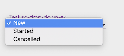
Resulting field on the form after clicking the dropdown:

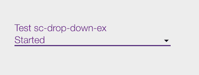
Resulting field on the form after selecting a value from the dropdown:

Resulting field field on the form after saving the document:

Resulting field in document and database after saving the document:
"testScDropDownEx": "Started"
