sc-datatables
This document is a user guide for the sc-datatables component release version 7.1.33.

1 Purpose
The "sc-datatables" component places a datatable field on a form. Datatables can be used to display:
- A table of documents, each satisfying defined criteria e.g. a table of an organisation's phone calls with all its customers.
- A table of child documents linked to parent document also displayed on a form e.g. a table of an organisation's phone calls with a particular customer.
The sc-datatables component definiton provides the abiliy to:
- Define the table content.
- Define the columns heading names.
- Display a drop down for selecting the number of table rows shown per page.
- Display a datatable search box field.
- Display a column filter field for each column.
- Enable column moving and/or resizing.
- Define a default column sort order.
- Provide the ability to export the table content as a CSV or PDF file.
- Provide the ability to select a table row and open the document linked to it.
- ... and many more.
Except for columns defined with "type": "array" or "type": "boolean" or "type": "object", each column header has a sort button  , providing the ability to sort the table in descending or ascending order of one of its columns.
The sc-datatables component is responsive to the size of the window i.e. when displayed on smaller windows, it automatically narrows column widths and/or hides one or more of its table columns, with the exception that column 1 is never hidden. When one or more columns are hidden, the expand icon  appears in the first column of each row. Clicking a row's expand icon will display the hidden columns and their values as shown in Example 3 .
The default responsive behaviour of each table column is dependent on the column order and width:
- Column 1 is never hidden.
- All column widths are subject to narrowing.
- Wider columns are hidden first.
The default responsive behaviour of a column can be overridden by defining the optional "responsive" field (2.3 Optional Customizable Fields) in its column definition.
The "sc-datatables" component definition provides fields for setting the properties of the table and the properties of each table column. These fields are fully described below.
2 Definition
The "sc-datatables" component is defined by a set of name/value pair fields consisting of:
- Required system fields
- Required customizable fields
- Optional customizable fields
Note:
- Default values for the fields described in the tables below are shown in bold text.
2.1 Required System Fields
| Field | Valid Values | Description |
|---|---|---|
| componentName | sc-datatables | The component name. Example: "componentName": "sc-datatables" |
2.2 Required Customizable Fields
| Field | Valid Values | Description |
|---|---|---|
| filter | elastic search query | Used when the "dataSource" field (2.3 Optional Customizable Fields) is defined as "dataSource": "database".Defines an Elasticsearch query for selecting the documents to display as rows in the datatable. Example: "filter": "{'query':{'bool':{'must':[{'term':{'appTags':'acceptanceTestDataScDatatables'}},{'term':{'systemHeader.systemType':'document'}}]}}}"Note: The filter can also be set/changed using the "setFilter" Ruleset function as described in the setFilter Ruleset Function Guide. |
| gridColumns | Array of column definitions | An array of column definitions, each defining the properties of a datatable column. Each column is defined by a set of name/value pair fields, some being required, some being optional. Section 2.2.1 gridColumns Field lists and describes the name/value pair fields for defining the properties of a datatable column. |
| name | Any value written in camel case | The name of the "sc-datatable" field in the document and database.Example: "name": "testScDatatables" |
2.2.1 gridColumns Field
The gridColumns field listed in Section 2.2 Required Customizable Fields is an array of column definitions, each defining the properties of a datatable column.
This section lists and describes the name value pair fields for defining the properties of a datatable column.
2.2.1.1 Required System Fields
| Field | Valid Values | Description |
|---|---|---|
| field | A data source field name | The name of the child document field whose value is to be displayed in a datatable column. If a field does not exist in the child document then the template variable will be replaced by an empty string. Example: "field": "callDateTime"Below are examples of how to reference an array field value: "field": "callOperators.name""field" : "assetLocation.features[0].properties.suburb" |
2.2.1.2 Optional Customizable Fields
| Field | Valid Values | Description |
|---|---|---|
| cellFilter | Used in conjunction with the "filter" field (described below) defined as "filter": "dateFilter" or "filter":"numericFilter". |
|
| Valid date format | Defines the date/time display format to apply to each cell of a column defined with "filter": "dateFilter".Examples: "cellFilter": "date:'dd/MM/yyyy hh:mm:ss a'""cellFilter": "date:'MMM d yyyy hh:mm:ss a'""cellFilter": "date:'medium'"Note: The last two examples produce the same display format e.g. Feb 2, 2017 12:22:11 PM Defaults to: "cellFilter": "date:'dd/MM/yyyy hh:mm:ss a'". |
|
| Valid numeric format | Defines the numeric display format to apply to each cell of a column defined with "filter": "numericFilter".For a full list of valid numeric formats, refer to those listed for the "format" field in the sc-numeric component Guide.Example: To display numeric values with no commas, no decimal places, rounded to the nearest integer, use: "cellFilter": "0"Example: To display as currency e.g. display a dollar symbol, commas, 2 decimal places, rounded, use: "cellFilter": "$0,0.00"Example: To display as a percentage e.g. display percent symbol, 2 decimal places, rounded, use: "format": "0.00%"Defaults to display the value as saved in the database. |
|
| cellTemplate | Valid HTML | A custom template for styling each cell of an individual column. Example: Bold the contents of the column displaying "callCategory" field values. "cellTemplate": "<div class=\"beBold\" > <strong>{{row.callCategory}} </strong></div>"Example: Display the address elements from a geoJSON field "cellTemplate": "{{row.locationGeo.features[0].properties.streetNo}} {{row.locationGeo.features[0].properties.street}}, {{row.locationGeo.features[0].properties.suburb}}, {{row.locationGeo.features[0].properties.postcode}}" |
| displayName | Any value | The name to display as the column header. Example: "displayName": "Call Date & Time" |
| Child document field name | Defaults to the name of the child document field. | |
| enableColumnMoving | Defines column moving for an individual datatable column, overriding that defined for the entire datatable by the root level"enableColumnMoving" field (2.3 Optional Customizable Fields). |
|
| false | Disable column moving for an individual datatable column. Example: "enableColumnMoving": false |
|
| true | Enable column moving for an individual datatable column. Example: "enableColumnMoving": true |
|
Defaults to the value defined for the entire datatable by the root level"enableColumnMoving" field (2.3 Optional Customizable Fields). |
||
| enableColumnResizing | Defines column resizing for an individual datatable column, overriding that defined for the entire datatable by the root level "columnResizing" field (2.3 Optional Customizable Fields). |
|
| false | Disable column resizing for an individual datatable column. Example: "enableColumnResizing": false |
|
| true | Enable column resizing for an individual datatable column. Example: "enableColumnResizing": true |
|
Defaults to the value defined for the entire datatable by the root level"enableColumnResizing" field (2.3 Optional Customizable Fields). |
||
| filter | Use to specify a filter on an individual column. | |
| arrayFilter | Display all values when a field has an array of values. Example: "filter": "arrayFilter" |
|
| dateFilter | Used in conjunction with the "cellFilter" field (described above) to format a column displaying dates. The "cellFilter" field is used to set the date format.Displays the formated date/time values in local time. Example: "filter": "dateFilter" |
|
| numericFilter | Used in conjunction with the "cellFilter" field (described above) to format a column displaying numerics. The "cellFilter" field is used to set the numeric format, the default format being "0,0".Example: "filter": "numericFilter" |
|
| headerRotate | Defines the orientation of the header text for an individual datatable column, overriding that defined for the entire datatable by the root level headerRotate field (2.3 Optional Customizable Fields). |
|
| rotateUp | The individual column header text is rotated 90° in a clockwise direction. Example: "headerRotate": "rotateUp" |
|
| rotateDown | The individual column header text is rotated 90° in an anticlockwise direction. Example: "headerRotate": "rotateDown" |
|
Defaults to the value defined for the entire datatable by the root level "headerRotate" field (2.3 Optional Customizable Fields). |
||
| headerWrapping | Defines wrapping of the header text for an individual datatable column, overriding that defined for the entire datatable by the root level "headerWrapping" field (2.3 Optional Customizable Fields). |
|
| false | Disables wrapping of header text for an datatable individual column. Example: "headerWrapping": false |
|
| true | Enables wrapping of header text for an individual datatable column. Example: "headerWrapping": true |
|
Defaults to the value defined for the entire datatable by the root level "headerWrapping" field (2.3 Optional Customizable Fields). |
||
| href | Used to specify the hyperlink address when column values are displayed as a hyperlink. The hyperlink address can be an absolute URL, a relative URL, an email address or a phone number. Used in conjunction with:
|
|
| hyperlink specification | The hyperlink can specify a relative url, http, https, mailto:, tel: The hyperlink can contain {{{ }}} handlebar references to variables in the document linked to the selected row. Examples: "href": "/form/{{{documentId}}}""href": "/form/{{{assignee.0.documentId}}}""href": "https://comp-dev.formbird.com/form/{{{systemHeader.templateId}}}""href": "tel:{{{followUpEmail}}}""href": "tel:{{{followUpNumber}}}" |
|
| responsive | An array of 4 name value pairs | Used to override the default responsive behaviour of a table column when displayed on smaller windows. See section 1 Purpose for a description of responsive behaviour. Four name value pairs define the responsive behaviour of the column when displayed on extra small ("xs"), small ("sm"), medium ("md") and large ("lg") windows. Example: For a column with "width": 2, as windows get smaller, maintain its proportional width and if required hide the column on extra small windows."responsive": {"xs": 0,"sm": 2,"md": 2,"lg": 2}Example: For a column with "width": 3, as windows get smaller, reduce its proportional width and if required hide the column on small and extra small windows."responsive": {"xs": 0,"sm": 0,"md": 2,"lg": 3} |
Default value for the first column with"width": 2:"responsive": {"xs": 2,"sm": 2,"md": 2,"lg": 3} |
||
Default value for a non-first column with"width": 1:"responsive": {"xs": 0,"sm": 1,"md": 1,"lg": 1} |
||
Default value for a non-first column with"width": 2:"responsive": {"xs": 0,"sm": 0,"md": 2,"lg": 2} |
||
Default value for a non-first column with"width": 3:"responsive": {"xs": 0,"sm": 0,"md": 0,"lg": 3} |
||
Default value for a non-first column with"width": >3:"responsive": {"xs": 0,"sm": 0,"md": 0,"lg": >3} |
||
| sort | For all "dataSource" field values (2.3 Optional Customizable Fields), the "sort"field can be used to define a column's default sort "direction " and/or sort "precedence".For "datasource" field values "docArray" and "dataArray" the "sort"field can be used to define a column's sort "type".
Example: "sort": {"direction": "asc","precedence": 1"type": "caseInsensitive"},Note:
|
|
| type | The data type of a datatable column. Used in sorting. If not provided then the datatable will guess the type. Useful if the datatable guessing is not satisfactory. |
|
| boolean | Example:"type": "boolean" |
|
| date | Example:"type": "date" |
|
| number | Example:"type": "number" |
|
| object | Example:"type": "object" |
|
| string | Example:"type": "string" |
|
| url | Used in conjunction with the "href" and "urlOpenIn" fields to set a hyperlink on the column values.Example: "type": "url" |
|
| urlExportMode | When a datatable is exported as a CSV file or a PDF document, this column level "urlExportMode" field defines how to output an individual column's URL link field, hence overriding the root level urlExportModefield value (2.3.1.1 Optional Customizable Fields).The "urlExportMode" field uses the Excel HYPERLINK formula "=HYPERLINK("link location", "text to display")" to determine how to output a URL link field, where:
|
|
| excelFormat | Exporting a datatable as a CSV file. Output the column's URL link fields as a text string hyperlink, the text string being the "text to display" portion of the Excel HYPERLINK formula. Clicking the text string hyperlink will open the document whose URL address is the "link location" portion of the Excel HYPERLINK formula. Example: "urlExportMode": "excelFormat"E.g. if the Excel HYPERLINK formula of a URL link field is: "=HYPERLINK("https:// comp-dev-ng.formbird.com/form/fa528200-6b8f-11ed-9164-2d7622de8a5a", "Work Order 123")" then the URL link field will be output as "Work Order 123" displayed as a hyperlink. Clicking "Work Order 123" hyperlink will open the document located at "https:// comp-dev-ng.formbird.com/form/ fa528200-6b8f-11ed-9164-2d7622de8a5a" Exporting a datatable as a pdf document. Output the column's URL link fields as the Excel HYPERLINK formula displayed as plain text. Example: "urlExportMode": "excelFormat"E.g. if the Excel HYPERLINK formula of a URL link field is: "=HYPERLINK("https:// comp-dev-ng.formbird.com/form/fa528200-6b8f-11ed-9164-2d7622de8a5a", "Work Order 123")" then the URL link field will be output as "=HYPERLINK("https:// comp-dev-ng.formbird.com/form/fa528200-6b8f-11ed-9164-2d7622de8a5a", "Work Order 123")" displayed as plain text. |
|
| linkObject | Exporting a datatable as a CSV file. Output the column's URL link fields as a text string displayed as hyperlink, the text string being the value of the "text to display" portion of the Excel HYPERLINK formula. Clicking the text string hyperlink will open the document whose URL address is the "link location" portion of the Excel HYPERLINK formula. Example: "urlExportMode": "linkObject"E.g. if the Excel HYPERLINK formula of a URL link field is: "=HYPERLINK("https:// comp-dev-ng.formbird.com/form/fa528200-6b8f-11ed-9164-2d7622de8a5a", "Work Order 123")" then the URL link field will be output as: "Work Order 123" displayed as a hyperlink. Clicking "Work Order 123" hyperlink will open the document located at "https:// comp-dev-ng.formbird.com/form/ fa528200-6b8f-11ed-9164-2d7622de8a5a" Exporting a datatable as a PDF document. Output the column's URL link fields as a text string displayed as plain text, the text string being the value of the "text to display" portion of the Excel HYPERLINK formula. Example: "urlExportMode": "linkObject"E.g. if the Excel HYPERLINK formula of a URL link field is "=HYPERLINK("https:// comp-dev-ng.formbird.com/form/fa528200-6b8f-11ed-9164-2d7622de8a5a", "Work Order 123")" then the URL link field will be output as "Work Order 123" displayed as plain text. |
|
| linkOnly | Exporting a datatable as a CSV file.. Output the column's URL link fields as a URL address displayed as hyperlink, the URL address being the "link location" portion of the Excel HYPERLINK formula. Clicking the URL address hyperlink will open the document whose URL address is the "link location" portion of the Excel HYPERLINK formula. Example: "urlExportMode": "linkOnly"E.g. if the Excel HYPERLINK formula of a URL link field is "=HYPERLINK("https:// comp-dev-ng.formbird.com/form/fa528200-6b8f-11ed-9164-2d7622de8a5a", "Work Order 123")" then the URL link field will be output as "https:// comp-dev-ng.formbird.com/form/fa528200-6b8f-11ed-9164-2d7622de8a5a" displayed as a hyperlink. Clicking the URL address hyperlink will open the document located at "https:// comp-dev-ng.formbird.com/form/ fa528200-6b8f-11ed-9164-2d7622de8a5a" Exporting a datatable as a PDF document. Output the column's URL link fields as a URL address displayed as plain text, the URL address being the value of the "link location" portion of the Excel HYPERLINK formula. Example: "urlExportMode": "excelFormat"E.g. if the Excel HYPERLINK formula of a URL link field is "=HYPERLINK("https:// comp-dev-ng.formbird.com/form/fa528200-6b8f-11ed-9164-2d7622de8a5a", "Work Order 123")" then the URL link field will be output as "https:// comp-dev-ng.formbird.com/form/fa528200-6b8f-11ed-9164-2d7622de8a5a" displayed a plain text. |
|
| textOnly | Exporting a datatable as a CSV file or as PDF document. Output the column's URL link fields as a text string displayed as plain text, the text string being the value of the "text to display" portion of the Excel HYPERLINK formula. Example: "urlExportMode": "textOnly"E.g. if the Excel HYPERLINK formula of a URL link field is: "=HYPERLINK("https:// comp-dev-ng.formbird.com/form/fa528200-6b8f-11ed-9164-2d7622de8a5a", "Work Order 123")" then the URL link field will be output as "Work Order 123" displayed as plain text. |
|
| urlOpenIn | Used in conjunction with the "type", "url" and "href" fields to set a hyperlink on the column values. |
|
| newWindow | Opens a URL hyperlink in a new window. Example: "urlOpenIn": "newWindow" |
|
| overlay | Opens a URL hyperlink in a modal dialog overlaying the current window. Example: "urlOpenIn": "overlay" |
|
| currentWindow | Default value. Opens a URL hyperlink in the current window. Example: "urlOpenIn": "currentWindow" |
|
| visible | false | The datatable column is not visible. Example: "visible": false |
| true | Default value. The datatable column is visible. Note: If the entire datatable is set as "visible": false, then no column is visible irrespective of the value of this field. |
|
| width | Numeric | Display the column width as a proportion of the total width. Example: "width": 2If the width values of 4 datatable columns are defined as 1, 1, 2 and 1 respectively, then: Columns 1, 2, & 4 are of equal width, each being 1/5 of the total width. Column 3 width is double the width of column 1, being 2/5 of the total width. |
| 1 | Default value. |
2.3 Optional Customizable Fields
| Field | Valid Values | Description |
|---|---|---|
| allSelect | Used to define the behaviour of the "Select Multiple Rows" control located on the datatable header bar. Works in conjunction with the "multiSelect" and "pageSelect" fields with a prerequisite of "multiSelect": true .
|
|
| true | The datatable header bar shows the "Select Multi Rows" control which can function as a checkbox field or a dropdown field. The pageSelect field value (i.e. true or false) will define the "Select Rows" available dropdown options.Example: "allSelect": true |
|
| false | Default value. The datatable header bar does not show the "Select Multiple Rows" drop-down/checkbox field. |
|
| backgroundRefresh | A datatable field on a form will automatically refresh/reload when its "refreshInterval" field (see below) is defined with a value greater than zero, e.g. if "refreshInterval": 120 then the datatable field on the form will automatically refresh/reload every 120 seconds. The backgroundRefresh field defines if the automatic refreshing/reloading of a datatable field on a form will or will not continue when the form is sent to the background in the browser e.g. without closing the tab on which the form is displayed, navigate to or open another browser tab. |
|
| true | The automatic refreshing/reloading of a datatable field on a form will continue once the form is sent to the background in the browser. Example: "backgroundRefresh": true |
|
| false | Default value. The automatic refreshing/reloading of a datatable field on a form will not continue once the form is sent to the background in the browser. |
|
| childLabel | Used in conjunction with the "template" field (see below). |
|
| String | Defines the field label for the "Child Document Templates" dropdown field. Example: "childLabel": "Add a new phone call" |
|
| "Add a new child document" | Default value | |
| columnSearch | true | Display a column filter field for each datatable column, except for columns defined with:"type": "array" or "type": "boolean" or"type": "date" or"type": "object",The datatable will filter the table content, to only display rows having the values entered into one or more column filter fields. Example: "columnSearch": true |
| false | Default value. Do not display a column filter field for each datatable column. |
|
| dataSource | Defines the mode of sourcing the data to be displayed as rows in the datatable. | |
| dataArray | Works in conjunction with the below "dataSourceName" field.The "dataSourceName"field defines the name of the field on the document that contains the data to be displayed as rows in the datatable.The contents of this field is an array of string arrays where each string array contains the row data for the columns in order of their display in the datatable. Note, each string array must include a value for all columns. If no value should be displayed in a column, then the empy string "" should be used as the value for that column.Example: "dataSource": "dataArray"Note:
|
|
| docArray | Works in conjunction with the below "dataSourceName" field.The "dataSourceName"field defines the name of the field on the document that contains the data to be displayed as rows in the datatable.The contents of this field will be an array of objects that contain name value pair fields that match the fields specified in the column layout for the datatable. The objects can be formbird documents or just simple objects with the required fields. Example: "dataSource": "docArray"Note:
|
|
| database | Works in conjunction with a "filter" field (2.2 Required Customizable Fields) to define the documents to be displayed as rows in the datatable. |
|
| dataSourceName | Used when the "dataSource" field is defined as either "dataSource": "dataArray" or "dataSource": "docArray".The "dataSourceName"field defines the name of the field on the document that contains the data to be displayed as rows in the datatable.Rulesets can be used to prepare the contents of the field defined by "dataSourceName"field.Example: "dataSourceName": "meterErrors"Note: If "dataSource": "database" then columns are sortable based on their column definition, except for those columns defined with "type": "array" or "type": "boolean" or "type": "object". |
|
| delayBeforeCallNum | An integer value | The timeout delay in milliseconds when performing a search. Example: "delayBeforeCallNum": 1000 |
| 200 | Default value. | |
| disableAutoDisplay | Used in conjunction with the "multiSelect" field. |
|
| true | The document for the selected table row is not displayed under the datatable, regardless of the "multiSelect" field value.Example: "disableAutoDisplay": true |
|
| false | Default value. If "multiSelect": false, display the document for the selected row under the datatable. Deselecting the row will remove the display of its document from under the datatable.If "multiSelect": true, the document for the selected row does not display under the datatable. |
|
| disableSave | true | Changing the sc-datatables field (e.g. selecting a datatable row) does not trigger the Save icon to flash. Exiting the form without saving changes to the sc-datatables field does not trigger a warning message to display. In the Angular version of the sc-datatables component, clicking the Save icon will not save the sc-datatables field value to the document. E.g. selected datatable row(s) will not be saved to the document. In the AngularJS version of the sc-datatables component, clicking the Save icon will save the sc-datatables field value to the document. Example: "disableSave": true |
| false | Default value. Changing the sc-datatables field value (e.g. selecting a datatable row) does trigger the Save icon to flash. Exiting the form without saving changes to the sc-datatables field value does trigger a warning message to display. In both the Angular and AngularJS versions of the sc-datatables component, clicking the Save icon will save the sc-datatables field value to the document. I.e. the selected datatable row(s) will be saved to the document. If "selectOnLoad": true, then on reload, the saved selected datatable row(s) will be re-highlighted. |
|
| enabled | false | Allow the user to view table data but not change table data. Hence:
Example: "enabled": false |
| true | Allow the user to view and change table data. Do not display a Stop icon on mouseover of the functions that change Table data. |
|
| enableColumnMoving | true | Enables column moving for all columns of the datatable. Example: "enableColumnMoving": true |
| false | Default value. Disables column moving for all columns of the datatable. |
|
| enableColumnResizing | true | Enables column resizing for all columns of the datatable. Example: "enableColumnResizing": true |
| false | Default value. Disables column resizing for all columns of the datatable. |
|
| enforceWidth | false | Do not enforce proportional column width settings. Instead determine columns widths by the length of their data values. Example: "enforceWidth": false |
| true | Default value. Proportional column width settings are enforced and long data values may wrap. |
|
| exportSettings | Set of name/value fields | A set of name/value pairs that define the output settings to use when a datatable is exported as either a CSV file or a PDF document. Section 2.3.1 exportSettings Field lists and describes the name/value pair fields that define the output settings to use when a datatable is exported as either a CSV file or a PDF document. |
| exportTypes | Array of export types | Provides the ability to export the datatable by selecting an export type from an array of export types. The allowable export type values are 'CSV' and 'PDF'. Any other values will be ignored. Note:
Example: "exportTypes": ["CSV","PDF",] |
| Defaults to an empty array and hence no export options. No export buttons are displayed in the datatable header. | ||
| fontSize | Integer value | Defines the font size in pixels for the table header and datatable content. Example: "fontSize": 18px |
| 14px | Default value. | |
| forcePageInfo | false | If the datatable has less than one page of data, do not display the page information fields at the bottom of the datatable. Example: "forcePageInfo": falseNote: If the datatable has more than one page of data, regardless of the "forcePageInfo" value, the page information fields will always display at the bottom of the datatable. |
| true | Default value. Display page information at the bottom of the datatable when there is less than one page of data. |
|
| handlebarsHelpers | Defines a handlebar helper function which can be used to manupulate data, for example to uppercase all characters of a string. Section 3.3 Handlebars functions in Datatables details the defining and usage of the "handlebarsHelpers" field. |
|
| fullWidth | true | Display the datatable full width on the form. Recommend displaying datatables full width. Example: "fullWidth": true |
| false | Default value. Do not display the datatable full width on the form. |
|
| headerColor | Valid colour name or Hex value | Defines the column header text colour. Examples: "headingColor": "darkRed""headingColor": "#8B0000" |
| black | Default value. | |
| headerHeight | numeric value | Defines the table header row height in pixels. Example: "headerHeight": 50 |
| Defaults to a height that allows each column headers to be displayed in full allowing for column headings that need to wrap and a blank line above and below the column headers. | ||
| headerRotate | Defines the orientation of all the datatable column headings. Note: The column level "headerRotate" field (2.3 Optional Customizable Fields) can be used to define the orientation of an individual column heading, hence overriding this root level definition. |
|
| rotateUp | All datatable column headings are rotated 90° in a clockwise direction. Example: "headerRotate": "rotateUp" |
|
| rotateDown | All datatable column headings are rotated 90° in an anticlockwise direction. Example: "headerRotate": "rotateDown" |
|
| Defaults to no datatable column headings are rotated. | ||
| headerWrapping | Used to disable/enable wrapping of header text for all datatable columns. Note: The column level "headerWrapping" field (2.3 Optional Customizable Fields) can be used to define header text wrapping of an individual column, hence overriding this root level definition. |
|
| false | Disables wrapping of header text for all columns of the datatable. Example: "headerWrapping": true |
|
| true | Default value. Enables wrapping of header text for all columns of the datatable. |
|
| hideNoData | true | Hide the datatable if the "filter" field (2.2 Required Customizable Fields) returns no data.Example: "hideNoData": true |
| false | Default value. Do not hide the datatable if the "filter" field returns no data. |
|
| label | Any value | The name of the datatable field on the form i.e. the field label. Example: "label": "Test sc-datatables" |
| Defaults to the datatable field displays without a field label on the form. | ||
| lengthMenu | Array of integers | Defines the values for the datatable "Show Rows per Page" drop down field, allowing the user to select the number of datatable rows displayed per page. Example: "lengthMenu": ["5","10","25","50"]When defined as a 2 dimensional array, the 1st array lists the integer values for the number of rows per page, whereas the 2nd array lists how to display these integer values in the datatable "Show Rows per Page" drop down field. Example: "lengthMenu": [["5","10","25","50"],["Five","Ten","Twenty Five","Fifty"]] |
Defaults to:"lengthMenu": ["10","25","50","100"] |
||
| multiSelect | true | Enables the selection of multiple rows. Example: "multiSelect": true |
| false | Default value. Enables the selection of only one row. |
|
| noChildDocLink | true | When the document linked to the selected datatable row is displayed under the datatable, disable the hyperlink to the document. Example: "noChildDocLink": true |
| false | Default value. When the document linked to the selected the datatable is displayed under the datatable, enable the hyperlink to the document. |
|
| pageSelect | Prerequisites: "allSelect": true and "multiSelect": true .
|
|
| true | The datatable "Select Multiple Rows" dropdown lists 2 options: "Select Current Page" and "Select All".
Example: "pageSelect": true |
|
| false | Default value. The datatable "Select Rows" dropdown lists only 1 option: "Select All".
|
|
| refreshInterval | any integer | Sets the number of seconds to re-run the "filter" field Elasticsearch query for an automatic reload/refresh of the datatable.Example: "refreshInterval": 60 |
| 0 | Default value. No automatic reload/refresh of the datatable occurs. |
|
| rowsPerPage | Any integer | The number of datatable rows to display per page. Example: "rowsPerPage": 5Note: The "rowsPerPage" value needs to be one of the defined "lengthMenu" field (see above) values, for the "Show Rows per Page" drop down field to display it as the initially selected value. |
| 10 | Default value. Displays 10 datatable rows per page. |
|
| searchBoxAnyCase | Defines if the search for the value entered into the datatable search box field will be a case sensitive or a case insensitive search. Note: Formbird converts the value entered into the datatable search box field to lower case before inserting it into elastic query. |
|
| true | The search for the value entered into the datatable search box field will be a case sensitive search. Example: "searchBoxAnyCase": true |
|
| false | Defaut vaue. The search for the value entered into the datatable search box field will be a case insensitive search. |
|
| searchBoxFilter | Values entered into a datatable search box field are used as the 'search' term of a 'query_string' query. The datatable will then display, as rows in the datatable, those documents which satisfy the combined criteria of the 'query_string' query and the Elasticsearch query defined by the "filter" field (2.2 Required Customizable Fields).This "searchBoxFilter" field can be used to define the above mentioned 'query_string' query, otherwise the default 'query_string' query (see below) will be used.Note:
|
|
A valid 'query_string' query |
Defines the 'query_string' query used by datatable search box field.Example: "{'query_string':{'query':'*{{{search}}}*','analyze_wildcard':true,'allow_leading_wildcard':true,'default_operator':'OR','analyzer':'formbird_text_search','fields':['followUpNumber.lcase','contactPreferences.lcase']}}"The 'query_string' query in this example differs from the default 'query_string' query (see below), in that its 'default_operator' value is 'OR', and it will restrict the search for the value entered in datatable search box field to the 'followUpNumber' and the 'contactPreferences' fields of documents. |
|
Defaults to:"{'query_string':{'query':'*{{{search}}}*','analyze_wildcard':true,'allow_leading_wildcard':true,'default_operator':'AND','analyzer':'formbird_text_search'}}" |
||
| searchOptions | Set of name value pairs | Each name value pair defines the name and value of a search option. The currently available search options are:
"searchOptions": {"searchOfflineOnly": true"includeDeleted": true} |
Defaults to:"searchOptions": {"searchOfflineOnly": false} |
||
| selectOnLoad | true | On reload, re-highlight any saved selected datatable row(s). Example: "selectOnLoad": true |
| false | Default value. On reload do not re-highlight any saved selected datatable row(s). |
|
| showHeadings | false | Do not show the datatable column headings. Example: "showHeadings": false |
| true | Default value. Show the datatable column headings. |
|
| showReload | true | Show the datatable "Reload" button  in the datatable header bar, which when clicked, reloads the datatable in the default sort order (if specified by the column definitions). in the datatable header bar, which when clicked, reloads the datatable in the default sort order (if specified by the column definitions).Example: "showReload": true |
| false | Default value. Do not show the datatable "Reload" button in the datatable header bar. |
|
| showSearch | The datatable search box field provides the ability to search for a value within the datatable, excluding columns defined with:"type": "array" or "type": "boolean" or"type": "date" or"type": "object"On completion of a search, the datatable will display only those rows containing the value entered into the datatable search box field. |
|
| false | Do not show a datatable search box field in the datatable header bar. Example: "showSearch": false |
|
| true | Default value. Show the datatable search box field in the datatable header bar. |
|
| showSelected | The datatable "Items" field (displayed below the table) provides a count of the total number of datatable items (i.e datatable rows). The datatable "Rows Selected" field (displayed in the table header bar) provides a count of the datatable rows selected by the user. |
|
| false | Do not show the datatable "Items" and "Rows selected" count fields. Example: "showSelected": false |
|
| true | Default value. Show the datatable "Items" and "Rows selected" count fields. Example: "showSelected": trueE.g. If a datatable had 14 rows, 2 of which are selected then: "14 Items" would display below the datatable and "2 rows selected" would display in the datatable header bar. |
|
| template | Places a "Child Document Templates" dropdown list below the datatable. Each template provides the ability to create a child document for the current parent document displayed on the form. Selecting a template will display its fields under the datatable allowing the details of a new child document to be entered and saved. On save, the form displays the current parent document with the new child document added as row in the datatable. Provides the ability to:
You can only create child documents for a saved document, not for a template. Hence the "Child Document Templates" dropdown is enabled for a saved document, but is disabled for a template. Example: For a form displaying customer fields (e.g. name, address, etc) and a datatable displaying each phone call with the customer as a row in the datatable.
"template": [{"templateId": "07482740-7f3a-11e8-ba75-4d138b997968""name": "New Phone Call","default": {"customerPhoneCall": "documentId","customerId": "customerId"},},] |
|
| templateTarget | Defines how to display the template selected from the "Child Document Templates" drop down list. | |
| overlay | Display the selected template in a modal dialog overlaying the current window. Example: "templateTarget": "overlay" |
|
| currentWindow | Default value. Display the selected template below the datatable. |
|
| visible | false | The datatable is not visible on the form. Example: "visible": false |
| true | Default value. The datatable is visible on the form. |
2.3.1 exportSettings Field
The exportSettings field listed in Section 2.3 Optional Customizable Fields is a set of name/value pairs that define the output settings to use when a datatable is exported as either a CSV file or a PDF document.
This section lists and describes the name value pair fields for defining the export settings when exporting a datatable as either a CSV file or a PDF document.
2.3.1.1 Optional Customizable Fields
| Field | Valid Values | Description |
|---|---|---|
| dateFormat | Valid date format | On export of a datatable, defines the format of exported date/time values. Example 1: "dateFormat": "dd/MM/yyyy hh:mm:ss a"E.g. on export "24/11/2022 11:38 AM" will output as "24/11/2022 11:38 am" Example 2: "dateFormat": "MMM d yyyy hh:mm:ss A"E.g. on export "24/11/2022 11:38 AM" will output as "Nov 4 2022 11 :38:31 AM" |
| dd-MM-yyyy hh:mm a | Default value. E.g. on export "24/11/2022 11:38 AM" will output as "24-11-2022 11:38 am" |
|
| exportVisibleOnly | Based on column visiblity, defines which datatable columns to include in an exported datatable. | |
| true | On export of a datatable, only the datatable columns defined with "visible": true are include.Example: "exportVisibleOnly": true |
|
| false | Default value. On export of a datatable, all datatable columns are included, regardless of how their "visible" property is defined i.e. include datatable columns defined with "visible": true and those defined with "visible": false. |
|
| fontSize | Interger value | On export of a datatable, defines the font size for all exported data values. Example: "fontSize": 12 |
| 10 | Default value | |
| layout | portrait | On export of a datatable, defines the page orientation for the resulting export file. Example: "layout": "portrait" |
| landscape | Default value. | |
| margin | Integer valkue | On export of a datatable, defines the page margins for the resulting export file. Example: "margin": 50 |
| 0 | Default value. | |
| size | Valid paper size | On export of a datatable, defines the paper size for the resulting export file. Example: "size": "A3" |
| A4 | Default value. | |
| stripHTML | false | On export of a datatable, strips HTML tags from a string to return a string as normal text. Example: "stripHTML": false |
| true | Default value. | |
| urlExportMode | When a datatable is exported as a CSV file or a PDF document, this root level urlExportMode field defines how to output a datatable's URL link fields.The urlExportMode field uses the Excel HYPERLINK formula "=HYPERLINK("link location", "text to display")" to determine how to output URL link fields, where:
The default value for exporting a datatable as a CSV file is "urlExportMode": "excelFormat" .The default value for exporting a datatable as a PDF document is "urlExportMode": "textOnly".Note: The column level "urlExportMode" field defines how to output an individual column's URL link fields, hence overriding any root level "urlExportMode" field definition.The column level "urlExportMode" field is decribed in Section 2.4.2 Optional Customizable Fields. |
|
| excelFormat | Exporting a datatable as a CSV file. Output the datatable's URL link fields as a text string hyperlink, the text string being the "text to display" portion of the Excel HYPERLINK formula. Clicking the text string hyperlink will open the document whose URL address is the "link location" portion of the Excel HYPERLINK formula. Example: "urlExportMode": "excelFormat"E.g. if the Excel HYPERLINK formula of a URL link field is: "=HYPERLINK("https:// comp-dev-ng.formbird.com/form/fa528200-6b8f-11ed-9164-2d7622de8a5a", "Work Order 123")" then the URL link field will be output as "Work Order 123" displayed as a hyperlink. Clicking "Work Order 123" hyperlink will open the document located at "https:// comp-dev-ng.formbird.com/form/ fa528200-6b8f-11ed-9164-2d7622de8a5a" Exporting a datatable as a PDF document. Output the datatable's URL link fields as the Excel HYPERLINK formula displayed as plain text. Example: "urlExportMode": "excelFormat"E.g. if the Excel HYPERLINK formula of a URL link field is: "=HYPERLINK("https:// comp-dev-ng.formbird.com/form/fa528200-6b8f-11ed-9164-2d7622de8a5a", "Work Order 123")" then the URL link field will be output as "=HYPERLINK("https:// comp-dev-ng.formbird.com/form/fa528200-6b8f-11ed-9164-2d7622de8a5a", "Work Order 123")" displayed as plain text. |
|
| linkObject | Exporting a datatable as a CSV file. Output the datatable's URL link fields as a text string displayed as hyperlink, the text string being the value of the "text to display" portion of the Excel HYPERLINK formula. Clicking the text string hyperlink will open the document whose URL address is the "link location" portion of the Excel HYPERLINK formula. Example: "urlExportMode": "linkObject"E.g. if the Excel HYPERLINK formula of a URL link field is: "=HYPERLINK("https:// comp-dev-ng.formbird.com/form/fa528200-6b8f-11ed-9164-2d7622de8a5a", "Work Order 123")" then the URL link field will be output as: "Work Order 123" displayed as a hyperlink. Clicking "Work Order 123" hyperlink will open the document located at "https:// comp-dev-ng.formbird.com/form/ fa528200-6b8f-11ed-9164-2d7622de8a5a" Exporting a datatable as a PDF document. Output the datatable's URL link fields as a text string displayed as plain text, the text string being the value of the "text to display" portion of the Excel HYPERLINK formula. Example: "urlExportMode": "linkObject"E.g. if the Excel HYPERLINK formula of a URL link field is "=HYPERLINK("https:// comp-dev-ng.formbird.com/form/fa528200-6b8f-11ed-9164-2d7622de8a5a", "Work Order 123")" then the URL link field will be output as "Work Order 123" displayed as plain text. |
|
| linkOnly | Exporting a datatable as a CSV file.. Output the datatable's URL link fields as a URL address displayed as hyperlink, the URL address being the "link location" portion of the Excel HYPERLINK formula. Clicking the URL address hyperlink will open the document whose URL address is the "link location" portion of the Excel HYPERLINK formula. Example: "urlExportMode": "linkOnly"E.g. if the Excel HYPERLINK formula of a URL link field is "=HYPERLINK("https:// comp-dev-ng.formbird.com/form/fa528200-6b8f-11ed-9164-2d7622de8a5a", "Work Order 123")" then the URL link field will be output as "https:// comp-dev-ng.formbird.com/form/fa528200-6b8f-11ed-9164-2d7622de8a5a" displayed as a hyperlink. Clicking the URL address hyperlink will open the document located at "https:// comp-dev-ng.formbird.com/form/ fa528200-6b8f-11ed-9164-2d7622de8a5a" Exporting a datatable as a PDF document. Output the datatable's URL link fields as a URL address displayed as plain text, the URL address being the value of the "link location" portion of the Excel HYPERLINK formula. Example: "urlExportMode": "excelFormat"E.g. if the Excel HYPERLINK formula of a URL link field is "=HYPERLINK("https:// comp-dev-ng.formbird.com/form/fa528200-6b8f-11ed-9164-2d7622de8a5a", "Work Order 123")" then the URL link field will be output as "https:// comp-dev-ng.formbird.com/form/fa528200-6b8f-11ed-9164-2d7622de8a5a" displayed a plain text. |
|
| textOnly | Exporting a datatable as a CSV file or as a PDF document. Output the datatable's URL link fields as a text string displayed as plain text, the text string being the value of the "text to display" portion of the Excel HYPERLINK formula. Example: "urlExportMode": "textOnly"E.g. if the Excel HYPERLINK formula of a URL link field is: "=HYPERLINK("https:// comp-dev-ng.formbird.com/form/fa528200-6b8f-11ed-9164-2d7622de8a5a", "Work Order 123")" then the URL link field will be output as "Work Order 123" displayed as plain text. |
3 Using Handlebars in sc-datatables
3.1 Context Reference in Datatables Filter
The 'filter' query can reference data from the document context by using handlebars.
Example:
"{'query':{'bool':{'filter':[{'term':{'foreignField':'{{document.localField}}']}}}"
In the above example document.localField refers to a field present on the document. This field may be saved to the document, or present 'dynamically' by the user entering data in another field 3.4 Watching Fields For Changes
Data available in the context includes
- document - data from the document
- account - data from the current logged in user account
- tpl - data from the template
3.2 Context Reference in Datatables Columns
Use the 'cellTemplate' definition in the column to display fields.
Example:
"cellTemplate":"<div class='boldFont'>{{row.myField}}</div>"
Data available in the context includes
* document - data from the document
* account - data from the current logged in user account
* tpl - data from the template
* row - data from the document returned from the datatable filter
An important note for sorting and filtering on columns using cellTemplate: The sort and filter is done on the data defined by the 'field' NOT by the data returned by the cellTemplate function.
3.3 Handlebars functions in Datatables
In addition to simply referencing fields, functions to manipulate data can also be specified and data passed from the context to the function.
To achieve this you can use formbird block helper handlebars functions (described in Appendix E - Handlebars Usages in Formbird) or you can specify your own function(s).
Example:
"handlebarsHelpers": [
    {
        "name": "setPriority",
        "function": "function(priority) {
            return priority === 1 ? `<div class='redFont'>Urgent</div>` : `<div class='blueFont'>Normal</div>`
        }"
    }
]
The example above can of course be achieved inline with block helpers, but you will notice that this is standard javascript / html. The above example would be called from a column definition using 'cellTemplate' where the function is specified followed by function variables. Example:
"cellTemplate":"{{{setPriority row.priority}}}"
Note the triple braces used for handlebars to prevent HTML escaping.
Another example would be concatenating street address fields to display a complete address rather than single data fields per column
"cellTemplate":"{{{getAddress row.myAddressField}}}"
---------------------------------------------------
"handlebarsHelpers": [
    {
        "name": "getAddress",
        "function": "function(arg) {
            let address = '';
            if(arg?.features?.length){
                let prop = arg.features[0].properties;
                let unitNo = prop.unitNo ? prop.unitNo : '';
                let streetNo = prop.streetNo ? prop.streetNo : '';
                let street = prop.street ? prop.street : '';
                let suburb = prop.suburb ? prop.suburb : '';
                address = `${unitNo} ${streetNo} ${street} ${suburb}`;
            }
            return address;
        }"
    }
]
Code should be entered inline (no carriage returns).
Data returned from the function must be a string. This can present issues when using a function to alter a filter query. Take the example:
"{'query':{'bool':{'filter':[ {{{checkField document.myField}}} ]}}}"
The checkField function has to return a string, but it's difficult to use strings to manipulate the query, it's easier to use objects. Additionally if the function above doesn't return any value, then the query will return every document which isn't desirable.
"handlebarsHelpers": [
    {
        "name": "checkField",
        "function": "function(arg) {
            let term = {'term':{'defaultKey':'defaultValue'}};
            if(arg){
                term = {'term':{'hasMyField': arg }}
            }
            return JSON.stringify(term);
        }"
    }
]
The function above sets up a 'default' query term and if an argument is passed to the function the default term is changed to a query term for the argument passed. The term is then passed back to the filter 'stringified' as a string.
3.4 Watching Fields For Changes
The examples so far have used values saved to the document. We can 'watch' fields in the context for changes and pass these changes to handlebars to be used in the filter.
{
    "componentName": "sc-radio-list",
    "name": "filterGrid",
    "label": "Type",
    "fullWidth": true,
    "radioList": [
        "All",
        "Assets",
        "Components",
        "Work Orders",
        "Requests",
        "Reports",
        "Email Templates",
        "Configuration Import"
    ],
    "disableSave": true
}
"updateWatchFields": [
    "document.filterGrid"
],
This example will watch for changes in the sc-radio-list component 'filterGrid'. When the field changes, the handlebars function 'getType' is executed (the example is shown with line breaks for clarity):
"filter": "{ 'query':{'bool':{'filter':[{{{getType document.filterGrid}}}]}}}"
 "handlebarsHelpers": [
    {
        "name": "getType",
        "function": "function(arg){
            var terms = [{'term':{'systemHeader.systemType':'template'}},{'term':{'appTags':'ramFleet'}}];
            if(arg){
                var terms = {"All":[{'systemHeader.systemType':'template'},{'appTags':'ramFleet'}],
                            "Assets":[{'appTags':'asset'},{'systemHeader.systemType':'template'},{'appTags':'ramFleet'}],
                            "Components":[{'appTags':'ramFleet'},{'appTags':'assetComponent'},{'systemHeader.systemType':'template'}],
                            "Work Orders":[{'appTags':'workOrder'},{'systemHeader.systemType':'template'},{'appTags':'ramFleet'}],
                            "Requests":[{'appTags':'request'},{'systemHeader.systemType':'template'},{'appTags':'ramFleet'}],
                            "Reports":[{'appTags':'formbirdReports'},{'systemHeader.systemType':'document'}],
                            "Email Templates":[{'appTags':'email_template'},{'systemHeader.systemType':'document'}],
                            "Configuration Import":[{'appTags':'ramFleet'},{'appTags':'csvImport'}]
                };
                terms = terms[arg].map( f => { return {'term':f } } );
            }
            var term = JSON.stringify(terms).replace('[','').replace(']','');
            console.log(term);
            return term;
        }"
    }
]
3.5 Putting it all together
The example below displays a list of templates that can be filtered by a radio list. The filter calls the 'getType' function on the first document load and whenever the 'filterGrid' radio list changes (updateWatchFields). On the first document load the function returns a default list of all templates. When the radio list is changed, the option is passed to the function which uses an object lookup to find the correct terms. The correct terms are then stringified and returned.
The cellTemplate in column definition 3 call constructs a table from the 'appTags' array field.
The href field in column 2 gets the documentId of the row and appends the template editor overlay to the result.
        {
            "componentName": "sc-radio-list",
            "name": "filterGrid",
            "label": "Type",
            "fullWidth": true,
            "radioList": [
                "All",
                "Assets",
                "Components",
                "Work Orders",
                "Requests",
                "Reports",
                "Email Templates",
                "Configuration Import"
            ],
            "disableSave": true
        },
        {
            "componentName": "sc-datatables",
            "detail": "",
            "filter": "{ 'query':{'bool':{'filter':[ {{{getType document.filterGrid}}} ]}}}",
            "fullWidth": true,
            "gridColumns": [
                {
                    "displayName": "Name",
                    "field": "systemHeader.summaryName",
                    "width": 2,
                    "urlOpenIn": "newWindow",
                    "href": "form/{{{row.documentId}}}",
                    "type": "url",
                    "sort": {
                        "direction": "asc",
                        "precedence": 1
                    }
                },
                {
                    "displayName": "Edit Link",
                    "field": "documentId",
                    "width": 2,
                    "urlOpenIn": "newWindow",
                    "href": "form/{{{row.documentId}}}/74746c80-8378-11e6-99b1-71ee944cf59f",
                    "type": "url"
                },
                {
                    "displayName": "appTags",
                    "field": "appTags",
                    "width": 2,
                    "cellTemplate": "{{{makeTable row.appTags}}}"
                }
            ],
            "label": "All Templates",
            "name": "gridCam",
            "rowsPerPage": 500,
            "showReload": true,
            "columnSearch": true,
            "disableSave": true,
            "disableAutoDisplay": true,
            "showHeadings": true,
            "updateWatchFields": [
                "document.filterGrid"
            ],
            "handlebarsHelpers": [
                {
                    "name": "getType",
                    "function": "function(arg){ var terms = [{'term':{'systemHeader.systemType':'template'}},{'term':{'appTags':'ramFleet'}}]; if(arg){ var terms = {"All":[{'systemHeader.systemType':'template'},{'appTags':'ramFleet'}], "Assets":[{'appTags':'asset'},{'systemHeader.systemType':'template'},{'appTags':'ramFleet'}], "Components":[{'appTags':'ramFleet'},{'appTags':'assetComponent'},{'systemHeader.systemType':'template'}], "Work Orders":[{'appTags':'workOrder'},{'systemHeader.systemType':'template'},{'appTags':'ramFleet'}], "Requests":[{'appTags':'request'},{'systemHeader.systemType':'template'},{'appTags':'ramFleet'}], "Reports":[{'appTags':'formbirdReports'},{'systemHeader.systemType':'document'}], "Email Templates":[{'appTags':'email_template'},{'systemHeader.systemType':'document'}], "Configuration Import":[{'appTags':'ramFleet'},{'appTags':'csvImport'}] }; terms = terms[arg].map( f => { return {'term':f } } ); } var term = JSON.stringify(terms).replace('[','').replace(']',''); console.log(term); return term; }"
                },
                {
                    "name":"makeTable",
                    "function": "function(arg){let table=`<table><tbody>`; if(arg?.length){arg.forEach(f => table +=`<tr><td>${f}</td></tr>`)}; table+=`</tbody></table>`;return table }"
                }
            ]
        },
4 Typical Definition
Below is a typical sc-datatables definition, defined with its required fields plus any optional field whose value is typically other than its default value.
        {
            "componentName": "sc-datatables",
            "name": "scDatatablesTypicalDefn",
            "label": "Phone Calls with Customer (Test Typical Defn)",
            "columnSearch": true,
            "dataSource": "dataArray",
            "dataSourceName": "meterErrors"
            "enableColumnMoving": true,
            "enableColumnResizing": true,
            "filter": "{'query':{'bool':{'must':[{'term':{'appTags':'acceptanceTestDataScDatatables'}},{'term':{'systemHeader.systemType':'document'}}]}}}",
            "fullWidth": true,
            "gridColumns": [
                {
                    "displayName": "Call Description",
                    "field": "systemHeader.summaryName",
                    "href": "/form/{{{documentId}}}",
                    "type": "url",
                    "urlOpenIn": "newWindow",
                    "width": 3
                },
                {
                    "displayName": "Call Date & Time",
                    "field": "callDateTime",
                    "cellFilter": "date:'dd/MM/yyyy hh:mm:ss a'",
                    "filter": "dateFilter",
                    "sort": {
                        "direction": "desc",
                        "precedence": 1
                    },
                    "type": "date",
                    "width": 2
                },
                {
                    "displayName": "Handled By",
                    "field": "callOperators.name",
                    "filter": "arrayFilter"
                    "type": "array",
                    "width": 1
                },
                {
                    "field": "callCategory",
                    "displayName": "Call Category"
                    "width": 1
                },
                {
                    "displayName": "Call Duration (mins)",
                    "field": "callDuration",
                    "cellFilter": "0",
                    "filter": "numericFilter",
                    "type": "number",
                    "width": 1
                },
                {
                    "displayName": "Follow Up?",
                    "field": "followUp",
                    "type": "boolean",
                    "width": 1
                },
                {
                    "displayName": "Follow Up Number",
                    "field": "followUpNumber",
                    "href": "tel:{{{followUpNumber}}}",
                    "type": "string",
                    "width": 1
                },
                {
                    "displayName": "Follow Up Email",
                    "field": "followUpEmail",
                    "href": "mailto:{{{followUpEmail}}}",
                    "type": "url",
                    "width": 1
                },
                {
                    "displayName": "Contact Preferences",
                    "field": "contactPreferences",
                    "width": 1
                }
            ],
            "showReload": true
        }
One or more of the optional customizable fields below can be included in the above definition should a value other than their default value be required.
ROOT LEVEL OPTIONAL CUSTOMIZABLE FIELDS:
            "allSelect": true,
            "backgroundRefresh": true,
            "childLabel": "Add a new phone call",
            "delayBeforeCallNum": 300,
            "disableAutoDisplay": true,
            "disableSave": true,
            "enabled": false,
            "enforceWidth": false,
            "exportSettings": {
                "dateFormat": "DD/MM/YYYY hh:mm a",
                "layout": "portrait",
                "fontSize": 12,
                "size": "A3",
                "margin": 50,
                "urlExportMode": "textOnly",
                "stripHTML": false,
                "exportVisibleOnly": false
            },
            "exportTypes": [
                "PDF",
                "CSV"
            ],
            "fontSize": "20px",
            "forcePageInfo": false",
            "headerColor": "darkRed",
            "headerHeight": 50,
            "headerRotate": "rotateUp",
            "headerWrapping": false,
            "hideNoData": true,
            "lengthMenu": [
                "5",
                "10",
                "25",
                "50"
            ],
            "multiSelect": true
            "noChildDocLink": true,
            "pageSelect": true,
            "refreshInterval": 60,
            "rowsPerPage": 5,
            "searchBoxAnyCase": true,
            "searchBoxFilter":"{'query_string':{'query':'*{{{search}}}*','analyze_wildcard':true,'allow_leading_wildcard':true,'default_operator':'OR','analyzer':'formbird_text_search','fields':['followUpNumber.lcase','contactPreferences.lcase']}}",
            "selectOnLoad": true,
            "showHeadings": false,
            "showSearch": false,
            "showSelected": false,
            "template": [
                {
                    "name": "New Phone Call",
                    "templateId": "07482740-7f3a-11e8-ba75-4d138b997968",
                    "default": {
                        "customerPhoneCall": "documentId",
                        "customerId": "customerId"
                    }
                }
            ],
            "templateTarget": "overlay",
            "visible":false,


GRIDCOLUMNS OPTIONAL CUSTOMIZABLE FIELDS:
           "cellFilter":"date: 'dd/MM/YY'",
           "cellTemplate": "<div class=\"beBold\" > <strong>{{row.callCategory}} </strong></div>",
           "enableColumnResizing": false,
           "enableColumnMoving": false,
           "headerRotate": "rotateUp",
           "responsive": {
               "xs": 0,
               "sm": 0,
               "md": 2,
               "lg": 3
           }
           "visible":false,
5 Examples
Example 1
A datatable of phone calls with customers.
This example uses a sc-datatables component defined with the typically needed fields.
        {
            "componentName": "sc-datatables",
            "name": "scDatatablesTypicalDefn",
            "label": "Phone Calls with Customer (Test Typical Defn)",
            "columnSearch": true,
            "enableColumnMoving": true,
            "enableColumnResizing": true,
            "filter": "{'query':{'bool':{'must':[{'term':{'appTags':'acceptanceTestDataScDatatables'}},{'term':{'systemHeader.systemType':'document'}}]}}}",
            "fullWidth": true,
            "gridColumns": [
                {
                    "displayName": "Call Description",
                    "field": "systemHeader.summaryName",
                    "href": "/form/{{{documentId}}}",
                    "type": "url",
                    "urlOpenIn": "newWindow",
                    "width": 3
                },
                {
                    "displayName": "Call Date & Time",
                    "field": "callDateTime",
                    "cellFilter": "date:'dd/MM/yyyy hh:mm:ss a'",
                    "filter": "dateFilter",
                    "sort": {
                        "direction": "desc",
                        "precedence": 1
                    },
                    "type": "date",
                    "width": 2
                },
                {
                    "displayName": "Handled By",
                    "field": "callOperators.name",
                    "filter": "arrayFilter"
                    "type": "array",
                    "width": 1
                },
                {
                    "field": "callCategory",
                    "displayName": "Call Category"
                    "width": 1
                },
                {
                    "displayName": "Call Duration (mins)",
                    "field": "callDuration",
                    "cellFilter": "0",
                    "filter": "numericFilter",
                    "type": "number",
                    "width": 1
                },
                {
                    "displayName": "Follow Up?",
                    "field": "followUp",
                    "type": "boolean",
                    "width": 1
                },
                {
                    "displayName": "Follow Up Number",
                    "field": "followUpNumber",
                    "href": "tel:{{{followUpNumber}}}",
                    "type": "string",
                    "width": 1
                },
                {
                    "displayName": "Follow Up Email",
                    "field": "followUpEmail",
                    "href": "mailto:{{{followUpEmail}}}",
                    "type": "url",
                    "width": 1
                },
                {
                    "displayName": "Contact Preferences",
                    "field": "contactPreferences",
                    "width": 1
                }
            ],
            "showReload": true
        }
Resulting field on the form:

Selecting a row from the table will:
- Highlight the selected row.
- Display under the datatable, the document linked to the selected row.
- Trigger the form's Save icon to flash.
Resulting field on the form after selecting a row from the table:

Clicking the form's flashing Save icon will create and save a document recording the selected datatable row.
Resulting field in the document and database after clicking the form's flashing Save icon:
"scDatatablesTypicalDefn": [
    {
        "documentId": "2e086080-cd1d-11ed-b7cd-fd6674b81c80",
        "name": "Incoming Call (Customer 5): Tue Mar 28 2023 15:01:29 GMT+1100 (Australian Eastern Daylight Time)"
}
Example 2
A datatable of phone calls with customers.
This example uses a sc-datatables component defined with the typically needed fields plus:
-
The following root level optional fields:
- "allSelect"
- "childLabel"
- "exportSettings"
- "exportTypes"
- "forcePageInfo"
- "lengthMenu"
- "multiSelect"
- "pageSelect"
- "rowsPerPage"
- "template"
- "templateTarget"
-
The following column level optional fields:
-
"responsive" (added to the "Handled By" column definition)
-
"cellTemplate" (added to the "Call Category" column definition)
- "headerRotate" (added to the "Follow Up" column definition)
-
        {
            "componentName": "sc-datatables",
            "name": "testScDatatablesNonTypicalDefn",
            "label": "Phone Calls with Customer (Test Non-typical Defn)",
            "allSelect": true,
            "childLabel": "Add a new phone call",
            "columnSearch": true,
            "enableColumnMoving": true,
            "enableColumnResizing": true,
            "exportSettings": {
                "urlExportMode": "textOnly",
                "dateFormat": "DD/MM/YYYY hh:mm a"
            },
            "exportTypes": [
                "PDF",
                "CSV"
            ],
            "filter": "{'query':{'bool':{'must':[{'term':{'appTags':'acceptanceTestDataScDatatables'}},{'term':{'systemHeader.systemType':'document'}}]}}}",
            "forcePageInfo": false,
            "fullWidth": true,
            "gridColumns": [
                {
                    "displayName": "Call Description",
                    "field": "systemHeader.summaryName",
                    "href": "/form/{{{documentId}}}",
                    "type": "url",
                    "urlOpenIn": "newWindow",
                    "width": 3
                },
                {
                    "displayName": "Call Date & Time",
                    "field": "callDateTime",
                    "cellFilter": "date:'dd/MM/yyyy hh:mm:ss a'",
                    "filter": "dateFilter",
                    "sort": {
                        "direction": "desc",
                        "precedence": 1
                    },
                    "type": "date",
                    "width": 2
                },
                {
                    "displayName": "Handled By",
                    "field": "callOperators.name",
                    "filter": "arrayFilter",
                    "responsive": {
                        "xs": 0,
                        "sm": 0,
                        "md": 0,
                        "lg": 1
                    }
                    "type": "array",
                    "width": 1
                },
                {
                    "displayName": "Call Category",
                    "field": "callCategory",
                    "cellTemplate": "<div class=\"beBold\" > <strong>{{row.callCategory}} </strong></div>",
                    "width": 1
                },
                {
                    "displayName": "Call Duration (mins)",
                    "field": "callDuration",
                    "cellFilter": "0",
                    "filter": "numericFilter",
                    "type": "number",
                    "width": 1
                },
                {
                    "displayName": "Follow Up?",
                    "field": "followUp",
                    "headerRotate": "rotateUp",
                    "type": "boolean",
                    "width": 1,
                },
                {
                    "displayName": "Follow Up Number",
                    "field": "followUpNumber",
                    "href": "tel:{{{followUpNumber}}}",
                    "type": "string",
                    "width": 1
                },
                {
                    "displayName": "Follow Up Email",
                    "field": "followUpEmail",
                    "href": "mailto:{{{followUpEmail}}}",
                    "type": "url",
                    "width": 1,
                },
                {
                    "displayName": "Contact Preferences",
                    "field": "contactPreferences",
                    "width": 1
                }
            ],
            "lengthMenu": [
                "5",
                "10",
                "25",
                "50"
            ],
            "multiSelect": true,
            "pageSelect": true,
            "rowsPerPage": 5,
            "showReload": true,
            "showSearch": true,
            "template": [
                {
                    "name": "New Phone Call",
                    "templateId": "07482740-7f3a-11e8-ba75-4d138b997968",
                    "default": {
                        "customerPhoneCall": "documentId",
                        "customerId": "customerId"
                    }
                }
            ],
            "templateTarget": "currentWindow"
        }
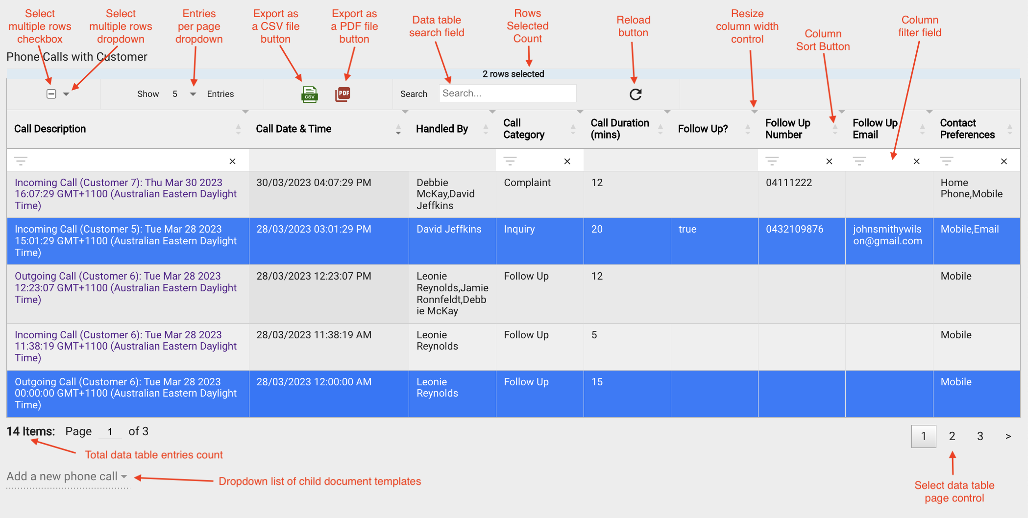
Resulting field on the form:

Example 3
The images below illustrate the responsive behaviour sc-datatables. I.e. when displayed on smaller windows, the table shown in Example 2 automatically narrows column widths and/or hides one or more of its table columns, with the exception that column 1 is never hidden. If one or more columns are hidden then a + icon appears in the first column of each row. Clicking a row's + icon will display the hidden column values below the row.
Responsive behaviour on a smaller device:
Columns widths are narrowed, the "Handled By", "Follow Up Number", Follow Up Email", and "Contact Preferences" columns are hidden and each row displays an expand icon .

Clicking a row's expand icon will:
- Expand the row, displaying the columns that were hidden and their values below the row.
- Replace the row's expand icon with the collapse icon


Clicking a row's collapse icon will:
- Collapse the row, hiding four of its column.
- Replace the the row's collapse icon with the expand icon